Lab 9: Suitability and Environmental Analysis
Xiaozhong Sun
2023-05-07
Due Date: April 12th
Instructor: Xiaozhong Sun (xs243@cornell.edu)
Lab TAs: Wenzheng Li (wl563) / Ishan Keskar (iuk3) / Aditi Parihar (ap973)
Location: Sibley 305, Barclay Gibbs Jones Computer Lab
Total Points: 100
Goals for this lab
Land cover has proven to be a good predictor of stream conditions when assessed at a regional scale such as the watershed level. Specifically, the percent of the watershed that is covered in forest or wetland has been shown to be positively related to stream quality, while coverage of agriculture or urban uses is correlated with decreasing stream quality. Consequently, stream health has impacts in terms of providing habitat, ensuring water quality, and flood control among other things.
In this lab, we will
- delineate a watershed based on a DEM,
- reclassify a land cover grid data to create a hierarchical index of stream quality, and then
- apply the newly classified land cover index to the watershed scale as well as riparian corridors.
This will require the use of several hydrology tools found in the Spatial Analyst Toolbox, as well as extensive use of map algebra. we will be also utilizing Modelbuilder. Before you begin:
- When using Modelbuilder, let the model finish computing each step before opening other applications.
- Save your model every step of your operation (in addition to your project)! When you go to open your model again, remember that you need to right click and ‘edit’, not ‘open’.
- Running Modelbuilder requires large amount of space, make sure you save your project before running the program. Sometimes, the software may freeze!
Watershed Delineation
For this exercise, we will analyze the Bear Creek watershed, which empties into Lake Ontario. In order to examine stream health, we will first delineate our watershed level study area.
Note: This lab will require a lot of intermediate analyses and the creation of many “in between” layers. As with the last lab, please create an output folder (separate from your working folder that contains all the output data, don’t save the outputs into the default geodatabase!).
- Open a new ArcGIS Pro.
- Open the Geoprocessing Toolboxes, and make sure you have enabled the Spatial Analyst tools by checking the ESRI extension under Project tab —> Licensing (this will allow us to view and analyze raster data). In this exercise we will be using both the Spatial Analyst extension as well as geoprocessing Toolboxes to carry out the analysis.
The first step will be to delineate the actual watershed of Bear Creek. We will add two layers, one is part of the Lake Ontario watershed (with UTM Zone 18N projection), and the other is a digital elevation model (referred to as a DEM).
- Add streams_utm. The streams layer depicts the hydrology for the area between Syracuse and Rochester, NY. The northern boundary is Lake Ontario. Note the projection (UTM or Universal Transverse Mercator). In addition, note the units in the lower right corner (meters).
- Now add the Digital Elevation Model (DEM) (name of file: Fill_37420781). The DEM covers a subsection of this area.
If you remember from the lecture, it takes several steps to prepare the raster layer for delineation:
- Fill sinks;
- Calculate flow direction;
- Calculate flow accumulation;
- Select a pour point; and
- Delineate the watershed.
Now we will use model builder.
- In Catalog pane, create a new tool entitled ‘watershed’ in your lab folder (right clicking on the data folder—>New—>Toolbox).
- Within this tool build a new model using ModelBuilder(right clicking on the newly created toolbox—>New—>Model).
- Adjust the ModelBuilder’s Environments (Within the ModelBuilder
Ribbon) settings as follows:
- Current workspace – set this to your lab_9 data folder
- Scratch workspace – set this to the Output folder you’ve created
- Extent: set this to fill_37420781 (the DEM)
- Cell size (resolution): set this to fill_37420781
The first step in preparing a DEM for delineation is to fill the sinks in our DEM - this removes small imperfections in the data. A sink is a cell with an undefined drainage direction; no cells surrounding it are lower. Fill can also be used to remove peaks. A peak is a cell where no adjacent cells are higher. Fortunately, this has already been done for this particular DEM, so we can skip this step.
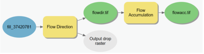
After that, we can establish a “flow direction” for each of the pixels.
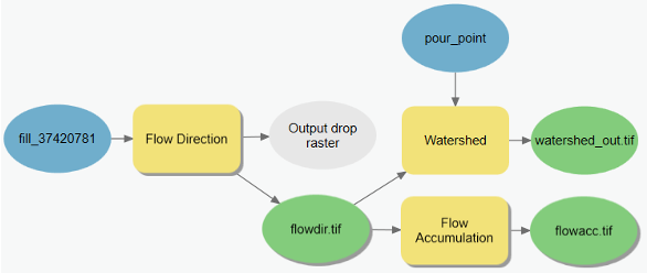
- Go to Geoprocessing Toolboxes—Spatial Analyst Tools—Hydrology—Flow direction – add (click on the tool and drag) this to your model window.
- Right-click on the tool, and click
open.
- Input the fill grid from the last step (fill_37420781) as the input surface raster. Rename the output ‘flowdir’. Note that raster output file name cannot exceed 13 characters. Leave the 8-way direction default in ‘Flow direction type’ box in the Flow Direction dialogue.
- Click OK, and run the model.
The result aggregates pixels into areas with consistent slope
directions. If flowdir (the output layer) is not automatically added to
your contents pane, go to the shape within your Modelbuilder represents
the output, right click on it and check add to display, the
layer should appear in the content pane. Otherwise, you may have to
manually add it from your Output local folder.
If you zoom in you should see that the pixels have been aggregated into separate fields, each indicating a separate direction (color coded). You may be able to discern where the valleys and stream channels are located.
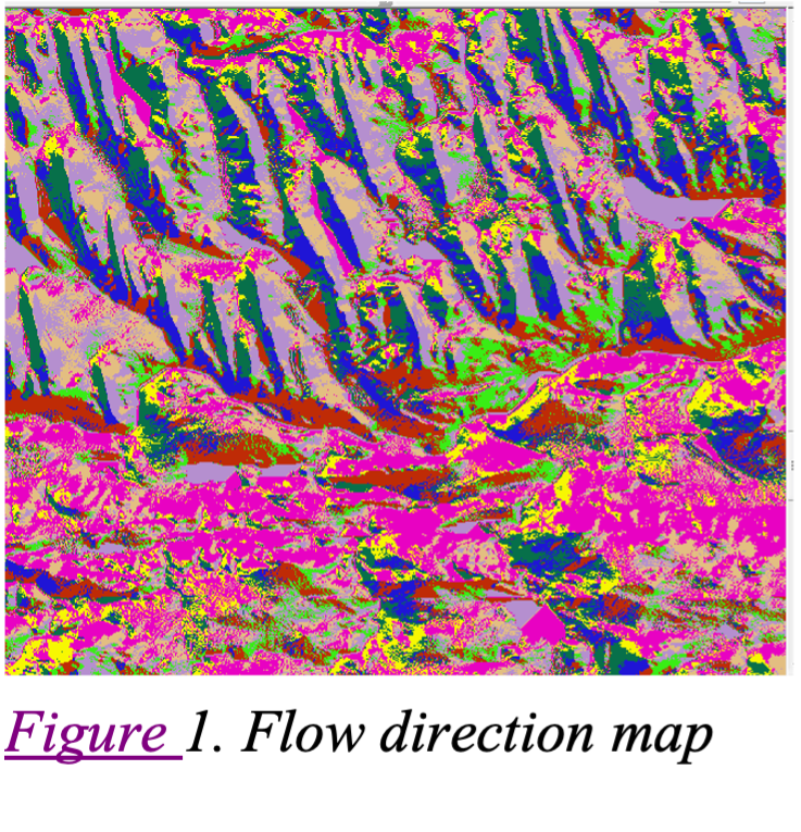
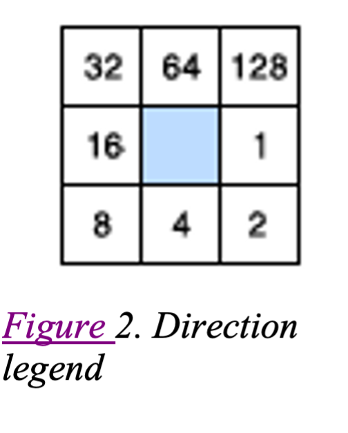
Remember from the lecture that the legend aggregates pixels by direction (color coded) like Figure 2.
Now we can establish a flow accumulation grid.
- Go to Geoprocessing toolboxes—Spatial Analyst Tools—Hydrology—Flow accumulation – add this to our model windon.
- Right-click on the tool, and click
open. - Input
flowdirvariable as the input layer (remember to select the variable under model variables, not the layers!!!).
- In the model, rename the output “flowacc.”
- Hit
Autolayoutwhich will automatically adjust and reposition the layout of your model. Verify that you have specified your model before running it. For starters, it should look like the one in Figure below. - Run the model.
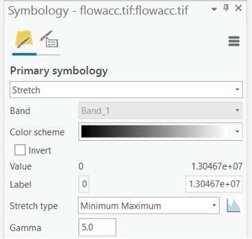
If your flow accumulation layer is not automatically added to your table of contents, follow the previous step to add it. Examine the legend for the flow accumulation grid. Most pixels in the image have small values, while a very few contain very large values.
Note that you may find the layer is not very visible, you need to change the symbology to easily see the flowacc layer. Try a classification method that exaggerates the difference between non-zero and low values. For example, try to use different stretch type and apply the Gamma stretch (normally 4-5 is good enough) if possible to make the high value cells stand out.
Q1. Based on drainage patterns, can you note certain features or patterns within the flow accumulation grid? Why do just a few pixels have such high values?
Q2. Zoom in and compare the flow accumulation grid to the streams_utm layer. Do they overlap exactly? Why not? Hint: think about the data sources and types
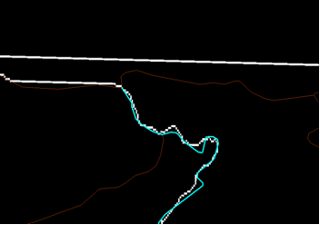
Now we need to identify an ending point (or “pour point”). This will signal that we are interested in all pixels which ultimately drain through Bear Creek into Lake Ontario. We will select the point where Bear Creek meets Lake Ontario. You can use the streams_utm attribute table to find Bear Creek. Once you’ve found Bear Creek, zoom in on the point where Bear Creek enters Lake Ontario. Note that there is not an exact overlap between your flow accumulation layer and the Streams_utm layer.
As we are creating our watershed based on the DEM, the pour point has to overlap the flow accumulation layer not the stream layer. When you are finished, your screen should now look something like Figure below.
Now we can place our pour point.
- In Catalog pane, create a new point shapefile in your output folder (name it ‘pour_point’).
- For the projection, assign it the same projection as ‘streams_utm’ The Spatial reference description should now read NAD_1983_UTM_Zone_18N.
- Edit (using
Edittab —>Createfunction, similar as the drop of observation points in previous lab) the pour points layer and place a point at the juncture. You may have to try this several times to make sure the point is correctly located.
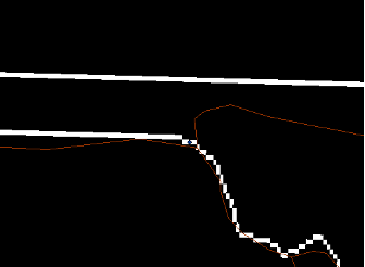
Map zoomed to the location where Bear Creek (selected) empties into Lake Ontario. Place the point for the pour point carefully within the first raster clump fully in Lake Ontario, as in the figure below.
When you are satisfied, save your changes and stop editing. You may want to adjust the size of the symbol so that it is visible. Note that we are not interested in creating any attribute information – we are merely interested in using this shapefile as a starting point for the watershed.
We now have all the input layers we will need to delineate a watershed – a flow direction raster and a pour point.
- Go to Geoprocessing Toolboxes—Spatial Analyst Tools—Hydrology—Watershed, add this tool to your model and open it.
- For the ‘Input D8 flow direction raster’, select the flow
direction output variable and under ‘Input raster or feature
pour point data’, select your pour point layer.
- Rename your output ‘watershed_out’ and click OK. Your model should now look like figure below. Be sure you differentiate between a ‘layer’ and a ‘variable’ at this time; otherwise your model will not look like this!
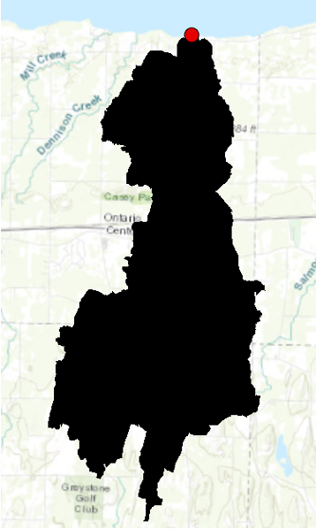
- Run the watershed tool. Add the layer. You may need to turn off the flow accumulation result layer to see your watershed layer. You should see something like Figure below.
Note: depending on where you placed the pour point, you may have some false starts. Arc is very picky about proper point placement! Do not be surprised if you have to go back and edit your point location incrementally.
Note that the watershed boundary crosses over a neighboring stream. Why do you think the stream layer does not line up with the watershed you created?
Use the ‘identify’ button and click within the watershed area and then outside of it. Note that the pixels either have a ‘0’ value within the watershed or a ‘no data’ value outside of it. In order that your screen refreshes quicker, you may want to at least turn off some of the layers we aren’t using.
“Clipping” the land cover to the watershed boundaries
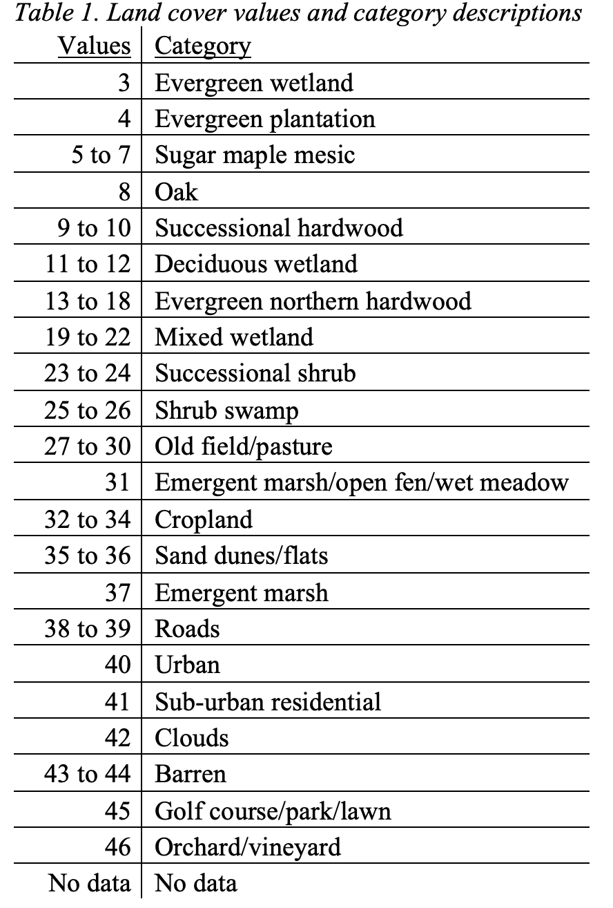
Now that we have created the spatial extent of our watershed, we need land cover data. Add lu_utm. This is a raster format land cover layer covering the range of the Genesee Land Trust (Lake Ontario forms the northern border). Note that values range from 3 to 46 – each of these numbers refers to a particular land cover.
We are only interested in the land cover within the Bear Creek watershed. We will create a mathematical expression to clip out the land cover layer area intersecting our new watershed. This is where the properties of raster data become apparent (and fun!). We know that the watershed layer is divided into either ‘0’ (within) or ‘Nodata’ (outside). Consequently, if we add the land cover layer (which, as mentioned, contains a range of values from 3 to 46) to the watershed layer, all calculations involving ‘Nodata’ will be nulled and the others will remain unchanged (because x+0 = x).
- Go to Spatial Analyst Tools—Map Algebra and add the Raster Calculator tool to your model and open the tool.
- In the ‘Map algebra expression’ box.
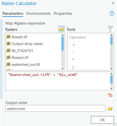
- Navigate and add (with a “+”) the watershed output variable to the ‘lu_utm’ layer. Note: The order in which you add the variables matters. Be sure you add the watershed output first, then the lu_utm.
- Click OK.
- Rename the output ‘watercover’ or something else by your preference (not exceed 13 characters) in the model, and run the raster calculator. Add the layer.
In effect, we have ‘clipped’ the land cover to the spatial extent of the watershed boundaries. Your output should look something like figure below.
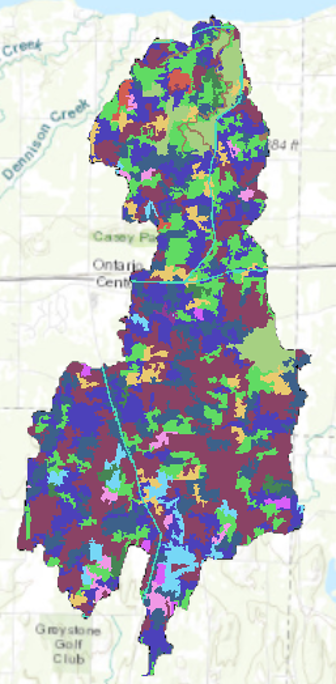
Now we have a land cover layer of the Bear Creek watershed. If you open the attribute table, you should see a column of values, ranging from 4 to 46 (each referring to a specific land cover category) and a column entitled ‘count’ (referring to how many pixels each land cover category contains).
Land Cover Analysis
In order to analyze land cover in the watershed, we need to create a hierarchy of land cover types as they pertain to stream quality. This will require us to reclassify the existing land cover categories. Currently, the ‘value’ column in the attribute table corresponds to Table 1 below. These are far too many land covers than we need to do our analysis.
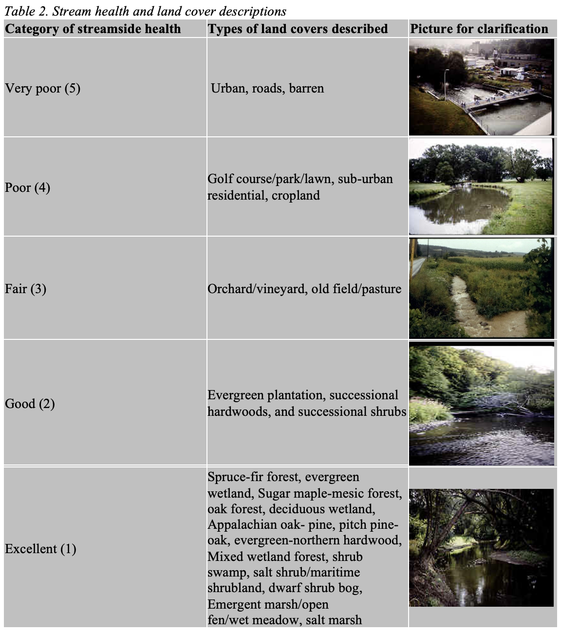
In order to make this dataset more manageable, let us reclassify (i.e. simplify) these values so we are using categories which make more sense in terms of their relationship to stream health. We will use two tables to create the reclassification scheme and examine water quality.
Table 2 is the product of research through the Cornell Department of Natural Resources examining the relationship between adjacent land cover and stream health. There is a fairly strong correlation between the amount of impervious surface and the relationship to stream health.
Raster values cannot be text, so instead you will have to recode using the following values from Table 2:
- Very poor = 5
- Poor = 4
- Fair =3
- Good = 2
- Excellent = 1
- Leave the ‘Nodata’ field as what it is.
Alright, now that we have examined the two tables, we can begin to build the reclassification algorithm.
- Go to Spatial Analyst Tools—Reclass and Add the Reclassify tool to your model and open it.
- Select the watershed land cover variable as the input raster and ‘value’ as your Reclass field. This lets Arc know we wish to reclassify the land cover according to the field ‘value’
- Click ‘unique’ – this will eliminate any redundant categories. you will see a window with columns of old (Value) and new values. The old values refer to the land cover classes (see Table 1 for reference).
- Refer to Table 2 to edit the new column field with the appropriate ordinal classification of stream side health. Please be careful when you lookup these two tables and don’t make mistakes.
- Use Table 1 to identify the ‘Old Values’ and Table 2 to create a new
classification.
- then click OK.
- Rename the output ‘ReclassLand’.
- Run the model.
- Add the new layer. The output raster should have very similar attribute information (i.e. columns with value and count), except recoded along your specifications.
Map 1: Include a map of your reclassified land cover (Make sure your legend makes sense).
Q3. Calculate the relative percentage of land cover within the watershed which is very poor (5), poor (4), Fair (3), Good (2), and Excellent (1). Create a well labeled table of your results.
Map 2: Create a map depicting all land rated ‘poor’ (4) or ‘very poor’ (5) in terms of watershed health.
Examining stream bank health
Having established a land cover classification for the entire watershed, we will now use the reclassified land cover map to calculate relative stream health. In order to do this, we need to examine the land cover immediately adjacent to the stream channels. This will require buffering the stream channels and overlaying the reclassified land cover.
However, we are obviously not interested in the entire streams_utm layer, but rather only those streams which drain the Bear Creek watershed. Select out those streams which fall for the most part within the Bear Creek watershed.
This time, manully select the streams use the
Selection tool by pressing the shift (see the Figure 9
below) and export to a new shapefile.
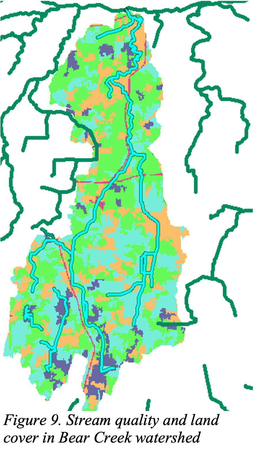
Q4: Why do some streams appear to cross watershed boundaries?
Now, we will analyze land cover (use the reclassified land cover layer as base) for those areas close to the bear creek and its tributes.
Create a buffer within 50 meters of Bear Creek and its tributaries. (Remember to dissolve ‘All’ when creating buffers)
In the next step, you will use your new buffer layer to clip your reclassified land cover layer.
- Open the Clip Raster from the Data Management toolbox/Raster/Raster Processing. (Compare this “Clip” with previous “Clip”; The latter is for vector data while the former is for raster).
- Use the reclassified land cover layer as your Input Raster, and define the Output Extent using your buffer layer.
- Remember to check the ‘Use Input Feature for Clipping Geometry’
box.
- Click OK.
- Run the model.
- Add the layer.
As with vector data, this Clip tool for raster data does not alter the attribute information of the output, even though it changes the geometry. When using vector data, we used the Calculate Areas tool to recalculate the areas of our clipped data. However, this will not work for raster data.
- Instead, go to the Data Management toolbox—Raster—Raster Properties—Build Raster Attribute Table.
- Use your clipped, reclassified land use layer as the input, and check the overwrite box to delete the existing table and to create a new one. The new attribute table will only include the pixel count of the visible extent of the raster layer.
Q5. Calculate the relative percentage of land cover within the stream buffers which is very poor (5), poor (4), Fair (3), Good (2), and Excellent (1) Create a well-labeled table of your results.
Q6. How do these figures compare with the entire study area? What can we say about the relative health of the Bear Creek riparian corridor relative to the Bear Creek watershed?
Including soil quality in the analysis
We will now expand our analysis to incorporate soil permeability. Soil type can help determine the degree of permeability (the degree to which water will either infiltrate into the soil or runoff) of a location. Soil permeability is important in discussing stream health because soils with high rates of runoff tend to exacerbate stream bank erosion and flooding.
Add soils_utm. Open up the attribute table. The table contains information concerning the hydrologic soil groups (HSG) and associated numerical values (HSGINT).
HSG or Hydrologic Soil Groups, is a classification of the Natural Resource Conservation Service and is based on the soil’s runoff potential. The classification breaks down as follows:
- Group A is sand, loamy sand or sandy loam types of soils - low runoff potential and high infiltration rates even when thoroughly wetted.
- Group B is silt loam or loam. It has a moderate infiltration rate when thoroughly wetted.
- Group C soils are sandy clay loam. They have low infiltration rates when thoroughly wetted and consist chiefly of soils with a layer that impedes downward movement of water
- Group D This group has the highest runoff potential. They have very low infiltration rates when thoroughly wetted and consist chiefly of clay soils with a high swelling potential, soils with a permanent high water table, soils with a clay pan or clay layer at or near the surface and shallow soils over nearly impervious material.
Question #7: Rasterize soils_utm and “clip” to the Bear Creek watershed boundaries. Please calculate the percentage of each soil classification for the watershed.
To rasterize the soil layer, we use the “Polygon to Raster” under “Conversion Tool”—“To Raster.”
- set the “soil_utm” as the input feature.
- specify HSGINT(the numerical values of HSG) as the Value field.
- use the land cover data to specify the cell size/resolution since we want to keep our cell size consistent for further “Map Algebra.”
We next clip the soil layer to the Bear Creek watershed using “Raster Calculator.”
- Go to Spatial Analyst Tools—Map Algebra and open the Raster Calculator tool
- Navigate and add (with a “+”) the watershed output variable to the rasterized soil_utm layer. Note: the order in which you add the variables matters. Be sure you add the watershed output first, then the rasterized soil layer.
Map 3: Create a combined map of soil and land cover classification for the Bear Creek watershed, on a best to worst scale (using raster calculator!). Such a classification should range from areas which have soils with high rates of infiltration and good adjacent land cover to areas which have soils with low rates of infiltration and poor land cover. Include your final map 3.
Remember: Land use within the watershed ranges from 1 – 5. Soil type within the watershed ranges from 2 – 4 (based on HSGINT)
Map 4: Create a map indicating those areas which are good, middle, and bad in terms of permeability and land cover based on your own judgement, e.g. >8 is good etc. Basically, you are re-symbolizing your previous score map into 3 categories: good/middle/bad
Now it’s your turn!!!
Watershed Delineation (10 points)
Q1. Based on drainage patterns, can you note certain features or patterns within the flow accumulation grid? Why do just a few pixels have such high values? (5 points)
Q2. Zoom in and compare the flow accumulation grid to the streams_utm layer. Do they overlap exactly? Why not? (5 points)
Land Cover Analysis (55 points)
Map 1: Include a map of your reclassified land cover (Make sure your legend makes sense). (10 points)
Q3. Calculate the relative percentage of land cover within the watershed which is very poor (5), poor (4), Fair (3), Good (2), and Excellent (1). Create a well labeled table of your results. (10 points)
Map 2: Create a map depicting all land rated ‘poor’ (4) or ‘very poor’ (5) in terms of watershed health. (10 points)
Q4. Why do some streams appear to cross watershed boundaries? (5 points)
Q5. Calculate the relative percentage of land cover within the stream buffers which is very poor (5), poor (4), Fair (3), Good (2), and Excellent (1) Create a well labeled table of your results. (10 points)
Q6. How do these figures compare with the entire study area? What can we say about the relative health of the Bear Creek riparian corridor relative to the Bear Creek watershed? (10 points)
Soil Analysis: (35 points)
Q7. Rasterize soils_utm and “clip” to the Bear Creek watershed boundaries. Please calculate the percentage of each soil classification for the watershed. (10 points)
Map 3: Create a combined map of soil and land cover classification for the Bear Creek watershed, on a best to worst scale (using raster calculator!). Such a classification should range from areas which have soils with high rates of infiltration and good adjacent land cover to areas which have soils with low rates of infiltration and poor land cover. (15 points)
Map 4: Create a map indicating those areas which are good, middle, and bad in terms of permeability and land cover based on your own judgement, e.g., >8 is good etc. Basically, you are re-symbolizing your previous score map into 3 categories: good/ middle/ bad (10 points)
The END