Lab 2: Thematic Mapping
2023-05-07
Due Date: Lab_2 Due: Feb 8
Instructor: Xiaozhong Sun (xs243@cornell.edu)
Lab TAs: Ishan Keskar [iuk3@cornell.edu]
Location: Sibley 305, Barclay Gibbs Jones Computer Lab
Total Points: 120
Goals for this lab
Today’s lab has two parts:
- Selecting features
- Cartography: Thematic Mapping
After today’s lab, you will be able to select and export features in varies ways; making thematic map showing patterns or distributions of variables of interests.
Starting today, please insert and start a new map session for each section. Otherwise, the new change you make will complete change the map you already made (you will lose what you have done). You can share a Layout, if your map design is similar, but you need to start a new map session if you want to keep a record of your previous work!
Know your data
For today’s lab, we will use a 2010 U.S. Census County boundary layer and a 2010 U.S. Census State boundary layer. These layers are already combined with other socioeconomic data, which we will employ later.
Selecting Features
Start a new map session and name it “selecting features”.
Now we will learn how to select features in ArcGIS. Selecting features are very handy when you want to edit GIS data. If you are doing an operation that includes editing or extracting a specific feature within a shapefile, you will likely need to select that feature.
There are several ways for you to select a feature.
Selecting through attribute table
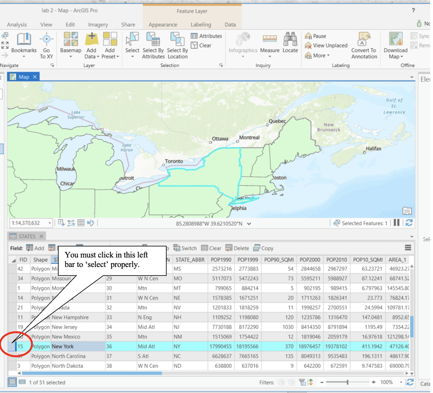
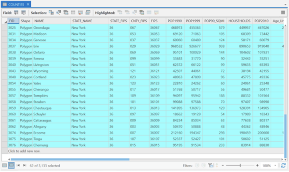
Right click on the STATES layer and select
Open Attribute Table. Right click on column header for the
“STATE_NAME” column, choose
Sort Ascending. Click in the left bar of the
row that contains New York (FID 15). See Figure below. Clicking this row
within the attribute table selects the feature. If you look at the map
pane in your window, notice that the border of New York State is
highlighted with the same color as it was highlighted in the attribute
table (fluorescent blue). You can also select multiple rows by holding
shift key.
Back in the Attribute Table window, right click on the left bar of
the selected state (New York) in the attribute table. Click
Zoom To. This zooms the display to the extent of the
feature, in this case, New York State. You may also do this through the
Navigate Group’s Zoom to selected features as
well.
- Note that if County layer is listed above State layer in your Layers pane (which is likely, since they are in alphabetical order in your directory) you will see the outlines of US counties within the highlighted area of New York State. This is somewhat misleading, because the selection is not done in the County layer. In your Layers pane, toggle on and off the Counties and States layers to see what happens. Make sure the layer of feature selected is on the top of your layer pane to avoid confusion.
Now let’s export the feature we just select. We will create a new shapefile of New York State. Sometimes, creating new layers limited to your study area minimizes the RAM, or memory required for processing. Extracting the study area (as this procedure is often called) is a necessary step of preparing data for GIS analysis.
With New York State being selected, right-click on the
States layer in the Contents Pane, choose
Data and click Export features.
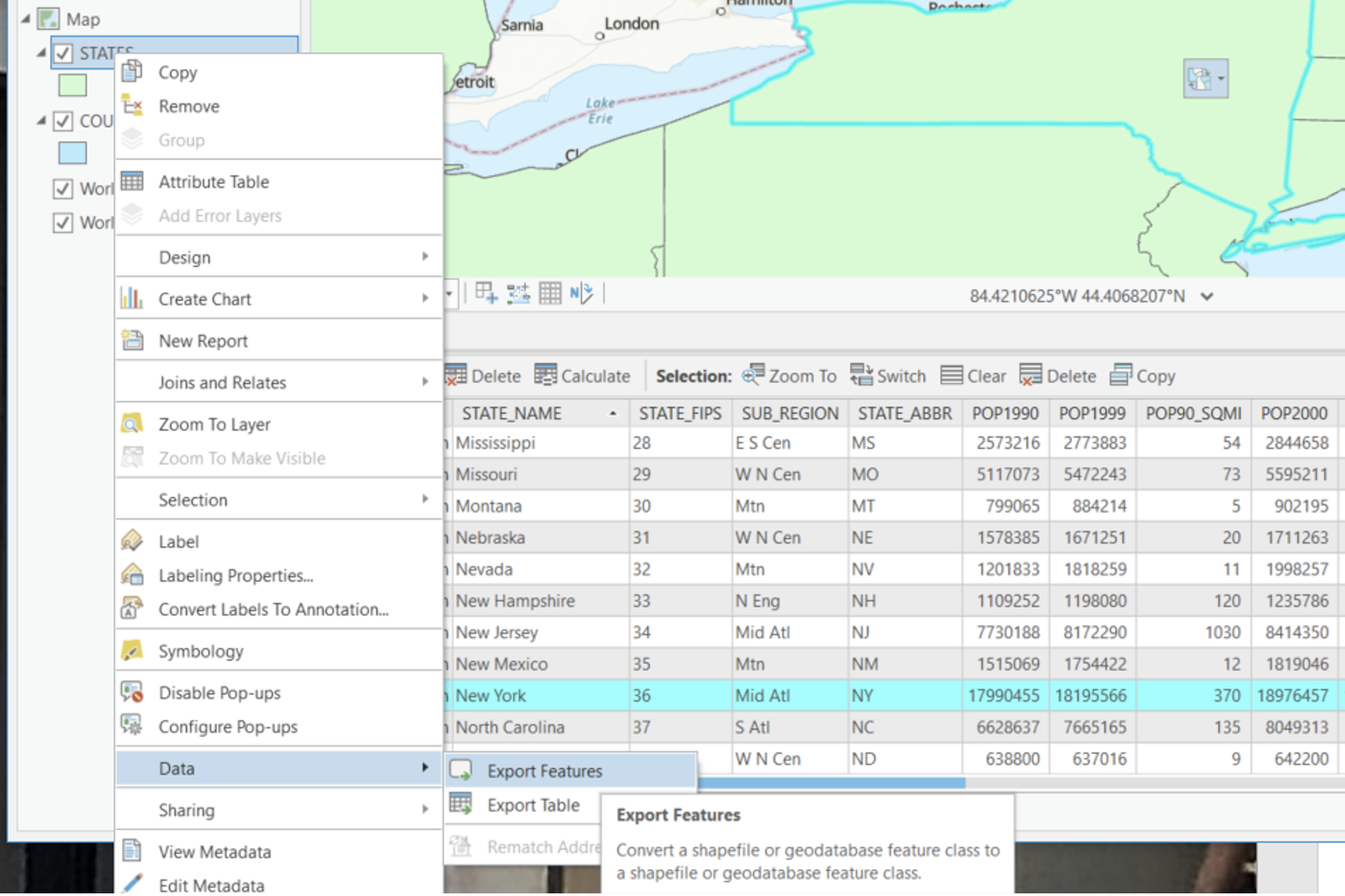
A Export Features dialog box should appear. Choose an
output location at your local drive where you store your lab_2 data.
Give the output the name nystate. This tool creates a new
layer only of the selected features. Click OK. You will see
that a new layer, nystate, is added to the
Contents Pane and a layer of only NY State is added to the
view.
Now remember to click
Clear Selected Features under the Selection
group. This un-select any features you have selected. This is important,
because it prevents you from doing operations on features you don’t
intend to alter.
Change the symbology of nystate so that it has no fill and a slightly thicker border than the counties borders.
Selecting through functions under the Selection group
Now let’s use the newly exported layer to practice other selection functions.
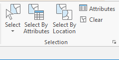
You can also select features through functions within the
Selection group. There are mainly two functions:
Selecting features by attribute/Querying the data and
Selecting by Location.
- Note that you can also select features using the
Select Features tooltip
Selectiongroup and deselect by clicking on white space in the Map pane. To select a feature this way, click on the tooltip to activate it, then click on the feature you wish to select. Play around with this. When you are done, clear selections.
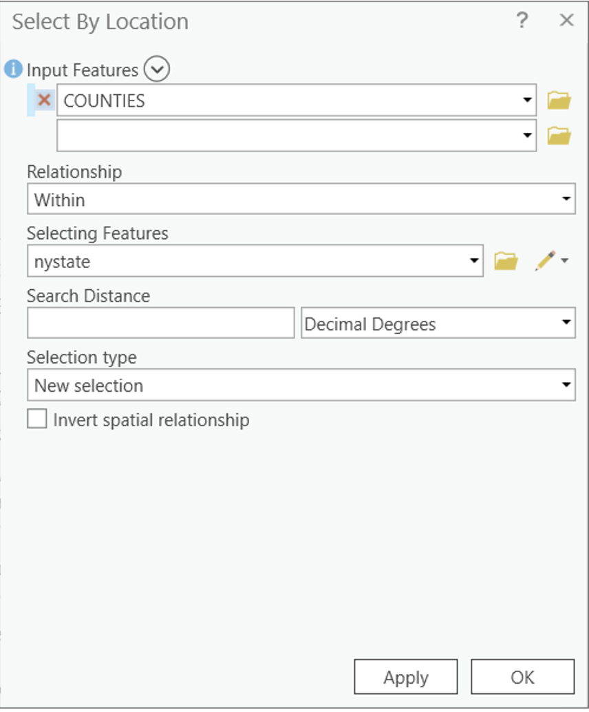
Under Selection group, click
Select By Location. We are going to select all the counties
that are contained in New York State. In the
Select Layer By Location dialogue box. Select
COUNTIES as the Input Feature,
Within as the Relationship. And
nystate as the Selecting Feature. Click
Apply and OK.
Now let’s check the results. Right Click on the Counties
layer, choose Open Attribute Table. In the lower left
portion of the table frame, click on the
Show selected records icon. This filters the table selected
features. You can see that all counties of New York state are
selected.
Now let’s repeat the export process, this time for all the counties
within NYS. Right-click on the Counties layer in the
Content Pane, choose Data and click
Export Features as we did above. Name the new layer
nycounties.
- As a point of comparison, you can explore different select by
location relationships (for example, try selecting counties that are
“completely within” New York State. You will note that this produces a
slightly different selection pattern). You can also use
Search Distancemeasurements.
Clear selected features. Change the symbology of nycounties so to
have no fill and a thinner border than the nystate border. Turn off the
original STATES and COUNTIES layer – we will
no longer need these for this analysis.
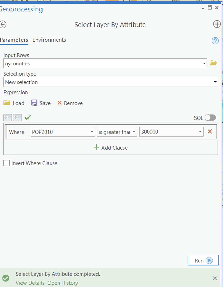
Now let’s practice how to select through query table. We will run a
query to find the number of counties with a population greater than
300,000. To do this, we will use the Select by Attributes
option from the Selection group. The dialogue box uses SQL
(structured query language) syntax, which is what many databases (even
non-spatial) databases are built with.
In the dialogue box, select nycounties for the input and
New selection for the selection type. Notice the
Where clause. A Where clause is part of a
SQL SELECT statement that specifies which rows to select.
Create the following expression: Where POP2010 is greater
than 300000. Click Run and close the dialog box.
Both the attribute table and the shapefile for “nycounties” should now
indicate 14 counties selected.
Open the Attribute Table and click the
Show selected records as we did before. This helps you
identify the names of selected counties. Export the selected counties
and create a new shapefile of NY counties with a population greater than
300,000. Under the options menu in the attribute table,
clear the selection and close the attribute table.
Now save your project!
Map 1
Create a map layout showing the counties in NYS that have a 2010 population of more than 300,000.
Thematic Mapping, Data Classification and Normalization
You will now create a series of thematic map layouts that use different data classification schemes to depict population density (Population per square mile, POP10_SQMI) in New York State, based on 2010 Census data. We will mainly work with Choropleth map and Proportional Symbol map.
Remember to start new map session and name it according to the theme of your map.
Please note that you are required to make a proper layout of each classification method, which means you need to include all the necessary elements of map layouts (As for whether to include a context map, you decide)! This is the time you practice what you have learned in lab_1. However, as these layouts are all fairly similar, you can create and reuse a single layout for each of them. My suggestion is that you finish editing the map first, and creating layout afterwards.
Also, please don’t forget to give your legend and title of the map proper names! You have to check out this Blog for some tips and tricks for working with legends in order to make a proper looking legend.
Map 2
Create a map layout using Natural Breaks classification.
Steps:
- In the
Content Pane, right click on the layer namenycountiesand selectSymbologytab. UnderPrimary SymbologyselectGraduated colors.
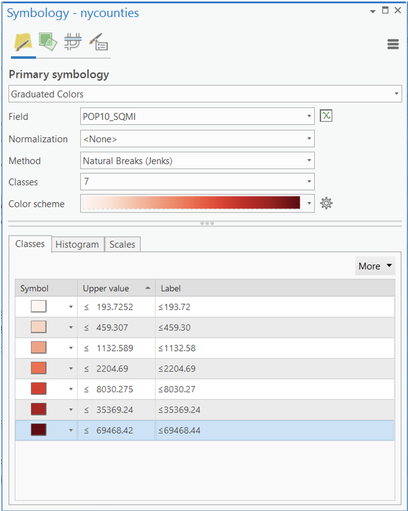
- Select
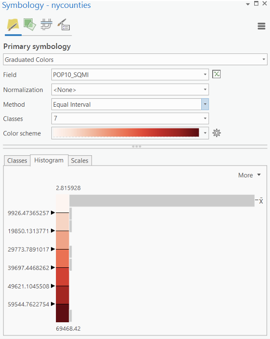
POP10_SQMIas the field. (“POP10_SQMI” represents population density of 2010, measured in population of 2010 per square mile.) - Based on the population density classification field, use the
default
MethondofNatural Breaks (Jenks). You can experiment with the number of classes, but it should be between 5 to 7 (This will be the rule for all thematic maps. No more than 7 classes!). Note that we did not useNormalization. We will explore this later in the lab. Next, select an appropriate color scheme (Generally monochromatic sequential color scheme works well for the given data range). - Under
Advanced Symbol Options
Label. For this case, population density should be measured using integer without decimal place. You should always check the meaning of your measurement before formatting your legend. - Close the dialog box when you are satisfied with your creation.
Map 3
Follow the same procedure as for Map 2, but use the equal interval classification method and create a new layout with all the appropriate elements.
When you change your classification, click on the
Histogram tab and notice how the data classification
intervals differ. This time, the majority of the counties fall into the
lowest category (This is because your data is highly skewed). As you can
see, the default is 5 groups or classes. Experiment with the number of
classes and settle on which one you find appropriate.
- If you are unhappy with the color schemes available in ArMap, you can make your own and save it. ArcGIS Pro is super powerful in customizing color scheme. Not only has it integrated all the ColorBrewer style and palette, you can import color scheme created by others. Check out this YouTube Video for showing you how to add two very cool Scientific Color Scheme to your ArcGIS Pro Project.
The Colorbrewer website is helpful for selecting colors for graduated and categorized maps, it is a great reference site.
Also, note that you can manually change the position of the bars of the Histogram by clicking and dragging them (if you wanted to create a custom or user defined classification). Notice that as soon as you drag one of the triangles, the Method switches to Manual Interval.
Note: Classification is for display purposes only – it does not alter the underlying data set. If we had 62 classes (one for each county), it would be very hard for the eye to distinguish between classes. The human eye good at only decipher at most 5-7 color groups.
Map 4
Follow the same procedure but use the Quantile
classification method and create a new layout with all the appropriate
elements. Experiment with the number of classes and settle on one you
find appropriate. As you toggle between the different classification
methods, please take a moment to notice the effect on the summary
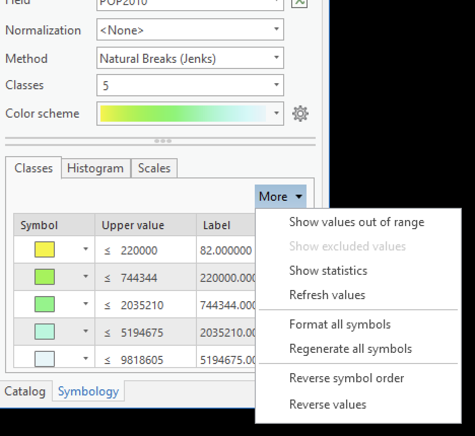
statistics, histogram, bars and break values. By clicking on the
More, you can click Show Statistics to explore
your data.
Map 5
Follow the same procedure but use the Standard Deviation
classification method and create a new layout with all the appropriate
elements. Experiment with the number of classes and settle on one you
find appropriate.
Question 1: Briefly describe and summarize some of the differences between the 4 kinds of classifications (i.e., natural break, equal interval, quantile, standard deviation). Which classification method in this case do you feel provides a better representation of population density? Provide a brief discussion of your reasoning.
- There is another classification method we don’t cover in the class
which is called
Geometrical Interval. “This classification method was used for visualizing continuous data and to provide an alternative to the Natural Breaks (Jenks), quantiles, and really any variance minimized (within classes) classification method. This method was designed to work on data that are heavily skewed by a preponderance of duplicate values, e.g., 35% of the features have a value of 2.0. For example, it could be used on a rainfall data in which only 15 out of 100 weather stations have recorded precipitation and the rest have no recorded precipitation, so their attribute values are zero.” Check out this blog for more information.
Map 6
Now let’s explore data normalization. When presenting data, particularly for spatial data enumerated within political or administrative boundaries, researchers will often want to normalize the data, rather than present the absolute value.
As you know from your statistical class, one way to accomplish this is by dividing each value by a total, converting the raw data into a proportion/percentage. Another way is to divide it by another variable of the relevant population, which converts the raw data into a ratio variable. By using a population density variable, we already explored one type of data normalization. Now let’s explore some others.
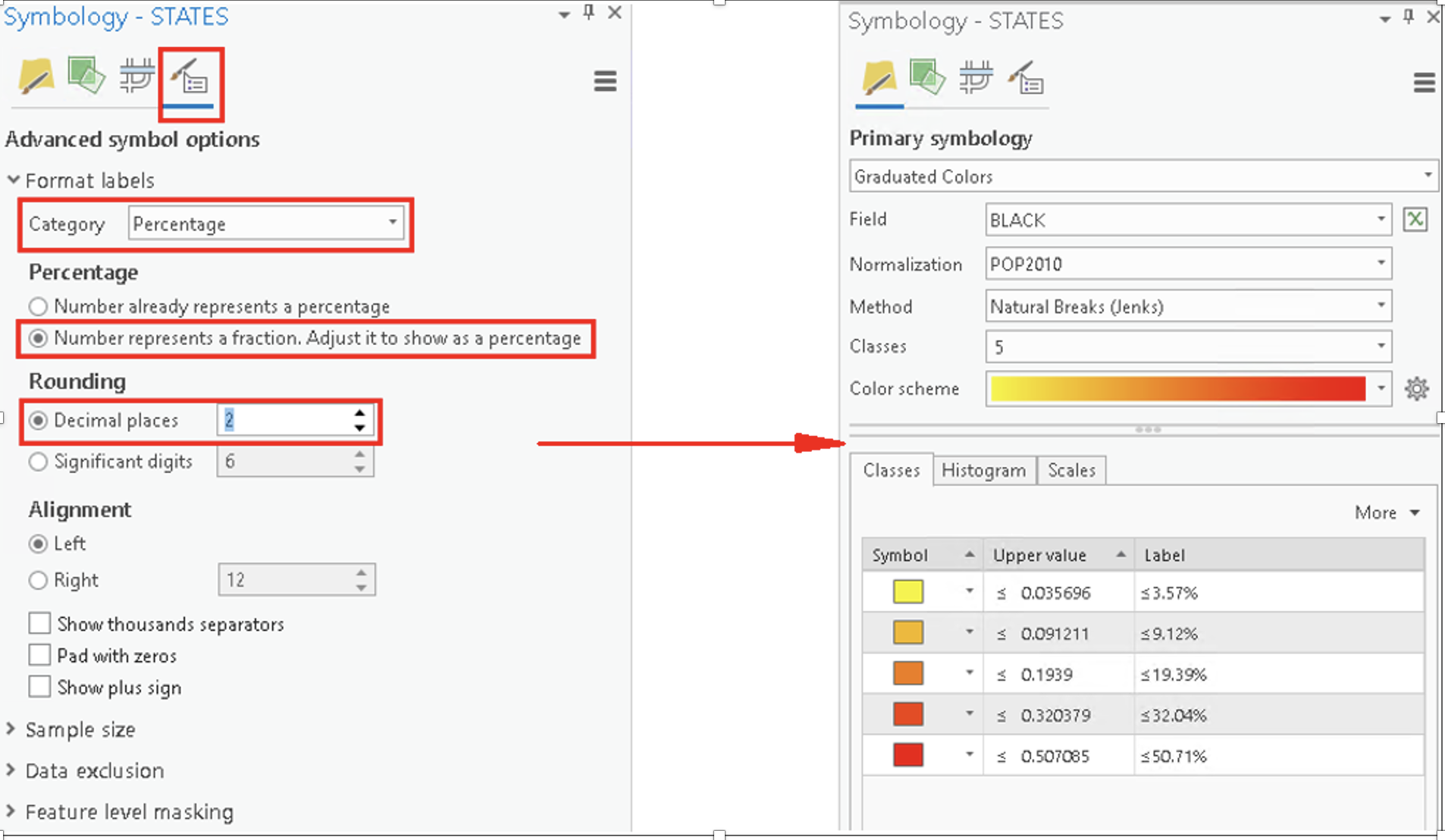
Add the STATES and COUNTIES layers. Right
click the layer STATES. In the Symbology tab,
select Graduated colors. Under the Field menu,
select BLACK. This displays the total African American
population for 2010 by state.
- Note the pattern – states with high populations tend to have large African American population.
Now under the Normalization menu, select
POP2010 – notice the change in the pattern. Note that we
have ratios instead of absolute population in the Label
columns. Experiment with the number of classes and the classification
method.
We need change the ratio to a percentage to better convey the
information. Click on the Advanced Symbol options. Under
Category, select Percentage. Check the box
Numbers represent a fraction and reduce the decimal places
to 2 (see box below). From now on, we leave two decimal
places (This will be the rule for all data/legend
formatting of quantitative thematic maps with decimal place.).
This will make our legend easier to interpret.
Now create a map layout of normalized African American population by State (Only Continental US).
Map 7
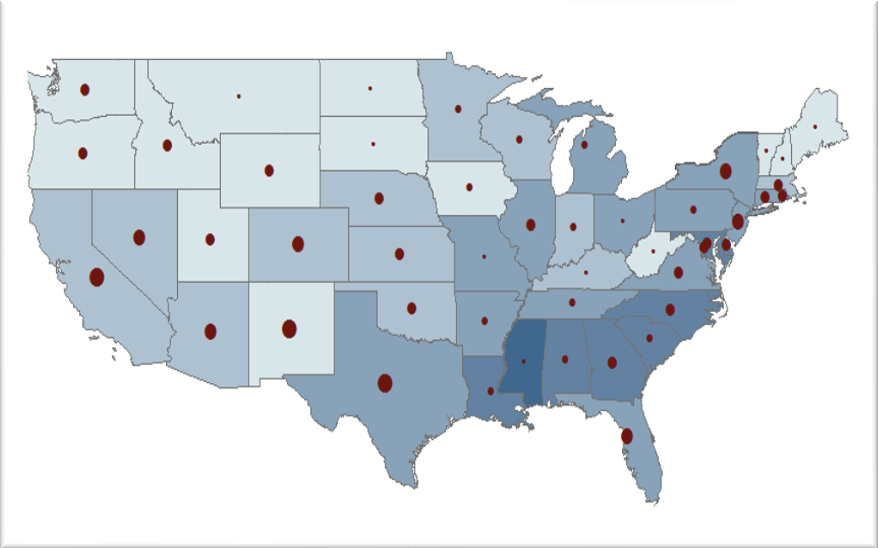
Create a multivariate map layout depicting normalized African American population and Hispanic population together.
Multivariate thematic maps are extremely useful finding spatial relationships. Let’s explore that relationship use your normalized layer of African American population to see if there is a spatial relationship between Hispanic and African American population.
Right now, you could copy and paste your states layer to the
Content Pane of you newly open map session. Insert a STATES
layer again and make sure your new STATES layer is on top. Give it
another name like State_Hisp_Pop.
This time, create a Graduated symbol map (not
graduated color map) of the Hispanic population, normalized by
the 2010 population. Adjust the colors and the size as you see fit. Your
map should look like the figure below.
Question 2: Is there a spatial relationship between African American population and Hispanic populations? Briefly explain.
Map 8
Now let’s learn to deal with extreme values/outliers. Extreme values sometimes are bad for making thematic map since they will affect our classification and mask more useful and important information we try to convey. Especially in some cases, if the extrme value represents measurement error or something doesn’t make sense. Therefore, we want to take a note (this is important!) and exclude them before making our maps.
But please keep in mind, excluding outliers should be your last resorts and should be carefully conducted. In general spatial analysis, the outliers very often carry important information!)
Using STATES layer, create a
Proportional Symbol Map of US states using the field
POP10_SQMI. What happened?
Washington DC has a very high population density and it’s creating a giant circle on the map. Looks like we have a outliers-problem here. To confirm this, we will undertake some exploratory spatial data analysis.
Under the Feature layer tab, select Data
—> Visualize —> Create Chart.
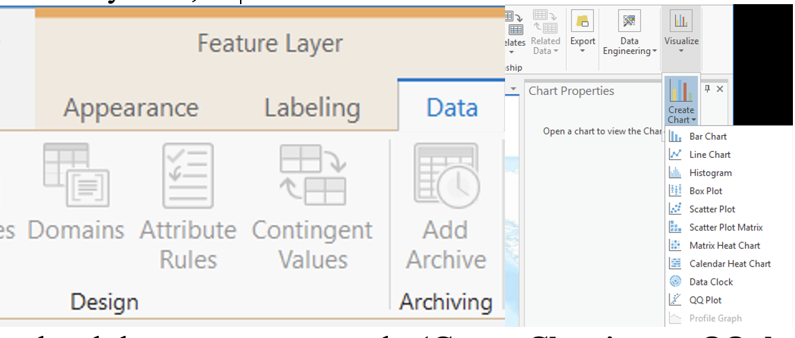
Some additional tools become apparent, under
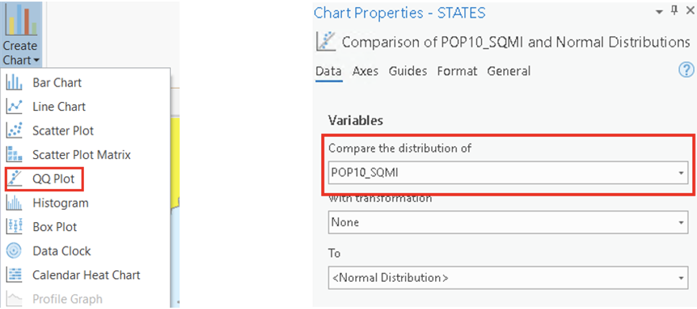
Create Chart, go to QQplot. In the
Chart Properties, under the Variables tab,
select compare the distribution of POP10_SQMI
to Normal Distribution.
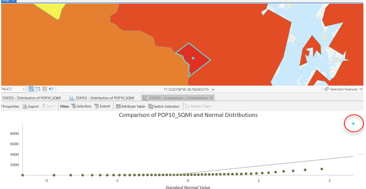
You will see the distribution of population density by state. Highlight the outlier (just click on the dot, also a new way to select a feature) in the upper right - Washington DC. Note how much the inclusion of DC is throwing the distribution off – the next highest value (New Jersey) is below the line that represents a ‘normal’ distribution.
You can also check the outlier using Histogram under
Create Chart. Select POP10_SQMI as the
Number. A histogram should appear at the bottom with a
chart properties box that contains some additional summary statistics.
Washington DC lies far to the right, so much so that most of the other
states fall into a single category. Note the
Chart Properties box. Let’s recap some basic statistics
that describe a distribution.
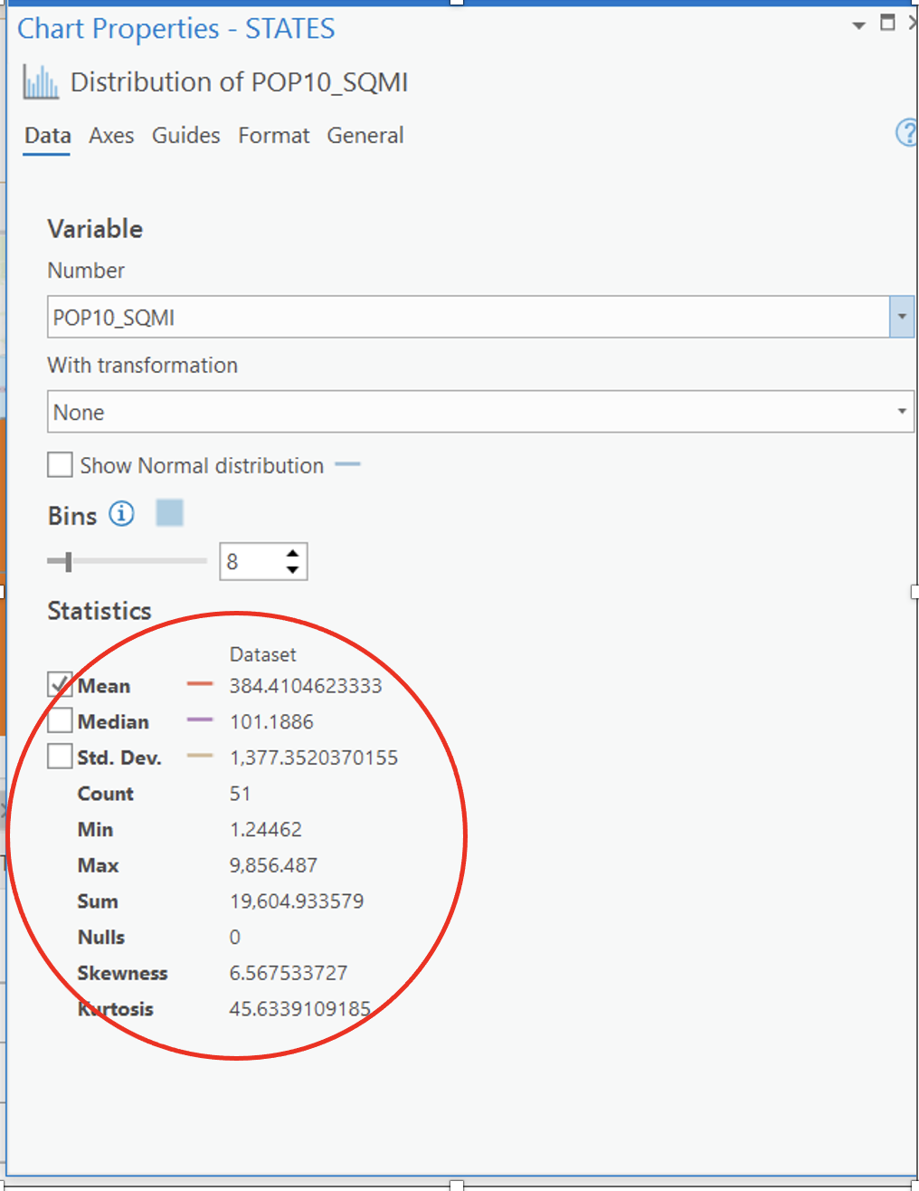
Skewness is a measure of the symmetry of a distribution.
- For symmetric distributions, the coefficient of skewness is zero.
- If a distribution has a long right tail of large values (i.e., Washington DC), it is positively skewed.
- If it has a long-left tail of small values, it is negatively skewed.
- In addition, note that the mean (384) is larger than the median (101), also indicating a positively skewed distribution (the opposite would be true for a negatively skewed distribution).
Kurtosis is a measure of whether the data are heavy-tailed or light-tailed relative to a normal distribution. That is, data sets with high kurtosis tend to have heavy tails, or outliers. Data sets with low kurtosis tend to have light tails, or lack of outliers. Normal distributions produce a kurtosis statistic of about zero.
Clearly, we can and should exclude Washington DC to create a more sensible thematic map.
Let’s build a query to do so using SQL.
- In the
symbologydialog box, go toAdvanced Symbol options, and openData Exclusion.
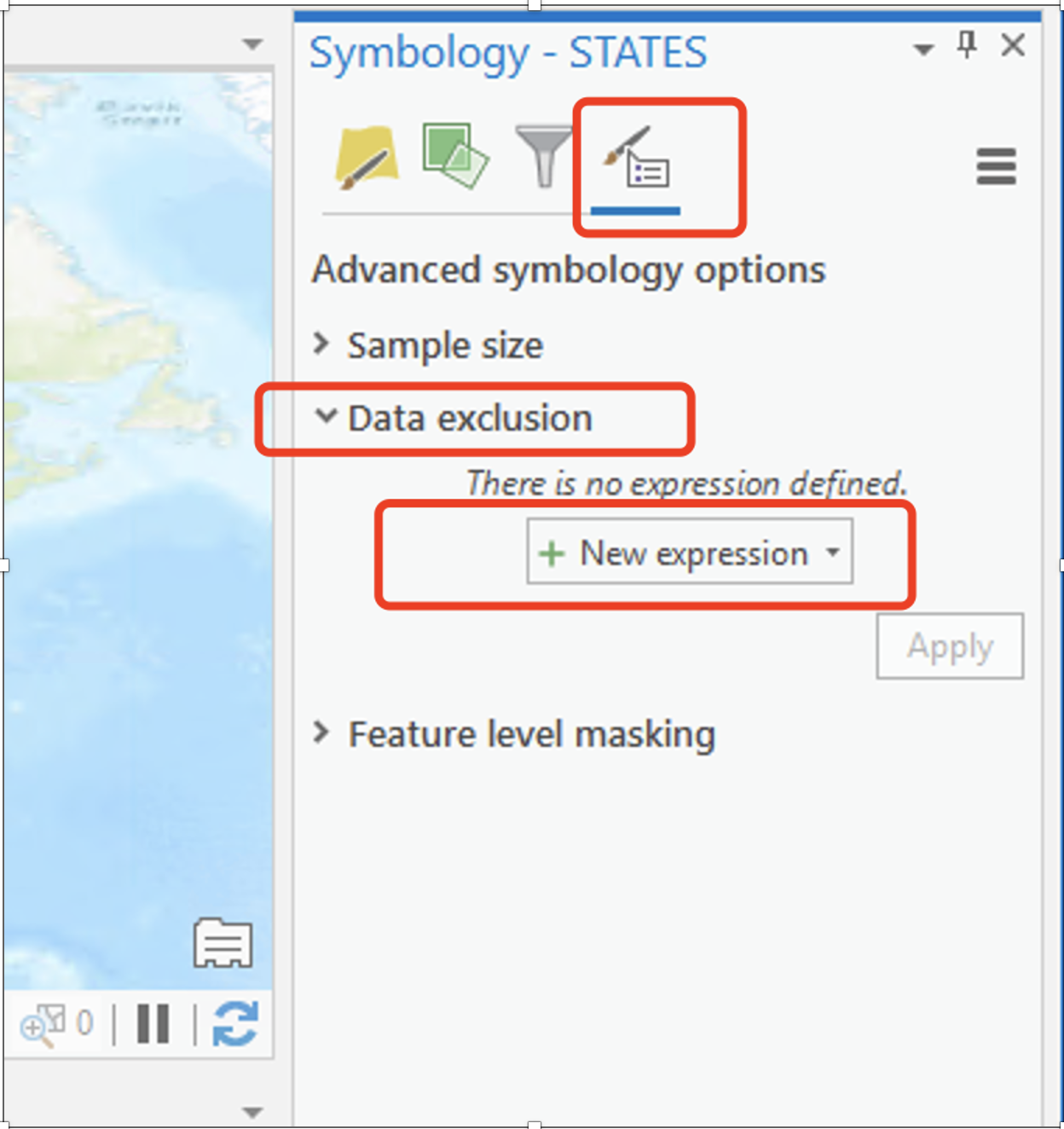
- Add an expression (
+ New expression) and complete theWhereclause that will exclude the District of Columbia.
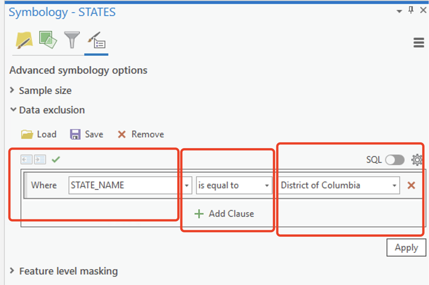
There are multiple ways to exclude DC, e.g., you can set “Where” to “STATENAME” and “is equal to” DC’s name.
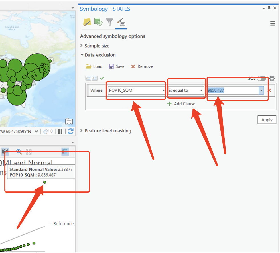
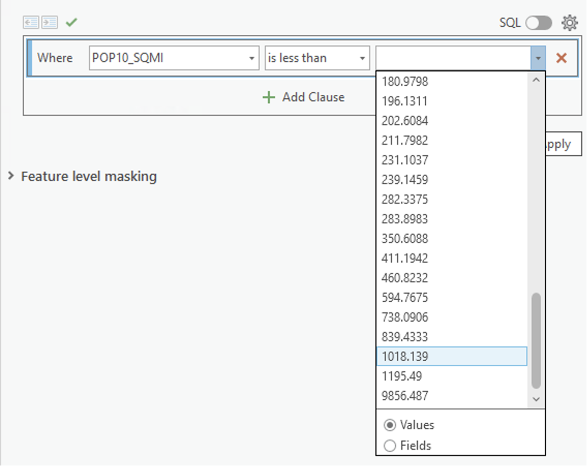
Or set “Where” = POP 10_SQMI, and “is equal to” the value of DC’s POP10 density, which is the highest in the drop-down menu. Try them all or develop your own SQL.
Then click Apply and look at the resulting effect on your map.
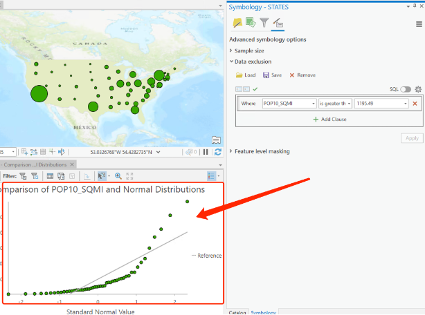
- Note: we haven’t removed DC from the data set, we are just excluding it from the map layout. Look at the updated QQ plot (histogram is still not updated, this is a bug of the software), see how the new plot looks different (the outlier is gone)
Now make a population density map layout using graduated colors by state exclude D.C.
Now it’s your turn!!!
Here is your second assignment. (Total points 120)
Please remember to include the classification methods in your maps’ note if data classification is used. Also, remember to include all elements for map layout to avoid points deduction.
In the first part of assignment (90 points), just finish Map 1 - 8 and answer Question 1-2 follow our lab instructions. These maps are 10 points each, and questions are 5 points each.
For the second part of the assignment:
- Map 9 (10 points): create a multivariate map layouts of New York State counties displaying the % of housing units which are renter occupied (RENTER_OCC) (normalized to the total number of housing units: HSE _UNITS) and the % population that has never been married, using “NMARRY00” (normalized to 1999 population).
Write a short answer to the following questions: Justify your choice of classification scheme (why you use this scheme); Discuss any spatial patterns you may notice. Is there a spatial relationship between these two variables?
Map 10 (20 points): Please follow this tutorial and make a thematic map of Indonesia population distribution in 2020. In this tutorial, you will advance your skill-sets as a map-maker. In particular, you need to pay attention to the following operations:
Learn when to use unclassed colors versus graduated colors.
Learn how to borrow colors from other map symbols, save a color to a style, and how to create transparent overlapping symbols.
Learn how to group and rename symbol classes and redesign template symbols for your own purposes.
adding, removing, and reordering basemap layers, adjusting their transparency and layer blending, check color-blindness through Color Vision Simulator.
The data for this map has been included in the lab_2 data folder as “IndonesiaPopulation.ppkx” (“.ppkx” is another type of project file format called project packages. It is like a zipped version of an ArcGIS Pro project. Read A guide to ArcGIS Pro project packages (.ppkx files)). You can directly open it in your Arcgis Pro.
Please make sure you follow the following requirements to obtain full mark:
- Please use a different color scheme other than Red-Purple (Continuous) stated in the instruction.
- Please add a scale bar, north arrow, title, and a note with your name, date.
- Please don’t export it as Pdf, choose a image file type.
The END