Lab 1: Get Familiar with ArcGIS Pro
2023-05-07
Due Date: Lab_1 Due: Feb 6
Instructor: Xiaozhong Sun (xs243@cornell.edu)
Lab TAs:
Location: Sibley 305, Barclay Gibbs Jones Computer Lab
Total Points: 100
Goals for this lab
If you’ve never used ArcGIS, today’s lab session will take you to familiarize yourself with it. The latest ArcGIS Pro has a very similar interface to software of Microsoft Office. They all have ribbon-based interfaces.
People’s learning curve for new software can vary from person to person. But most people tend to feel more or less frustrated when new to the software, and I am no exception. What I’m trying to say is that there’s probably no quick way to learn it. All you can do is use it as much as possible, get familiar with it, and don’t worry if you find yourself starting slow. We’ll have a semester to do that.
In today’s lab session, you will 1) learn the basic functions and windows layout (layers/panes) of ArcGIS Pro; 2) you will start to make a map. By the end of this lab session, you should be able to
- create folders/projects;
- add data;
- create a unique layer map;
- put together a map layout;
- use some of the primary analysis tools in ArcGIS Pro;
- and save your project.
Know your data
Take a look at your lab data. We don’t have too many data stored locally for our lab 1. Currently there are only six files with the same name, which represent polling places for Tompkins County (we will be adding more data later during this lab). Look at how the files are listed and organized. This is normally the file format supported by software such as ArcGIS and QGIS. This one layer of data is comprised of a number of files: a .shp file (the shapefile) and other support files: .sbn, .sbx, .shx, .prj (this one defines the projection) and .dbf (the last one contains the attribute information).[Hint: google these files’ suffix and get to know what they are. Google is always a good place to start when you stack or curious!!]
Create a project
You will notice that you have the option of opening a recent project
or template. As we have not created a project, on the opening page,
please click on the Map option under
Blank Templates.
The Create a new project dialog box opens. Give your
project a name (e.g., “lab_1”), and navigate to your lab_1 folder.
Uncheck the Create a new folder for this project box and
click OK.
Save your project
Know how to save your project is a good habit to get into early.
Under the Project tab, you can save your project. ArcGIS
Pro uses *.aprx as its default project file type. Remember to save your
project along the way!!!
ArcGIS Pro adopts project-based workflow like other development software. A Project in ArcGIS is a set of ArcGIS geographic and database files that have been saved in a certain organized form. It is a pointer to the locations of the actual files – it contains no real data, only file mapping information! You are not re-saving and changing any of the data in the map. This means if you move your data from one place to another, your project will lost its connection! If you were to copy the project file, you would merely be copying the “pointers”, NOT the actual data.
Therefore, it is important for you, from now on, to save all relevant data from the course folder to a well-labeled folder you have created on your drive or cloud. Most importantly, create and save your project file within that same folder.
If you edit or change any data file (for example: changed the name of the data in folder or moved them to other directories) related to a exiting project, once you reopen that project, the data you change might affect displaying the layers/data in maps. Your current project connection to the corresponding data is invalid. You have to rebuild the connection to restore the saved progress. See this detailed instruction on how to repair project items.
Introduction to the interface
The interface of ArcGIS Pro includes four major components: The
Ribbon, The Contets Pane, Map (View), and Catalog Pane and Others (see
below). 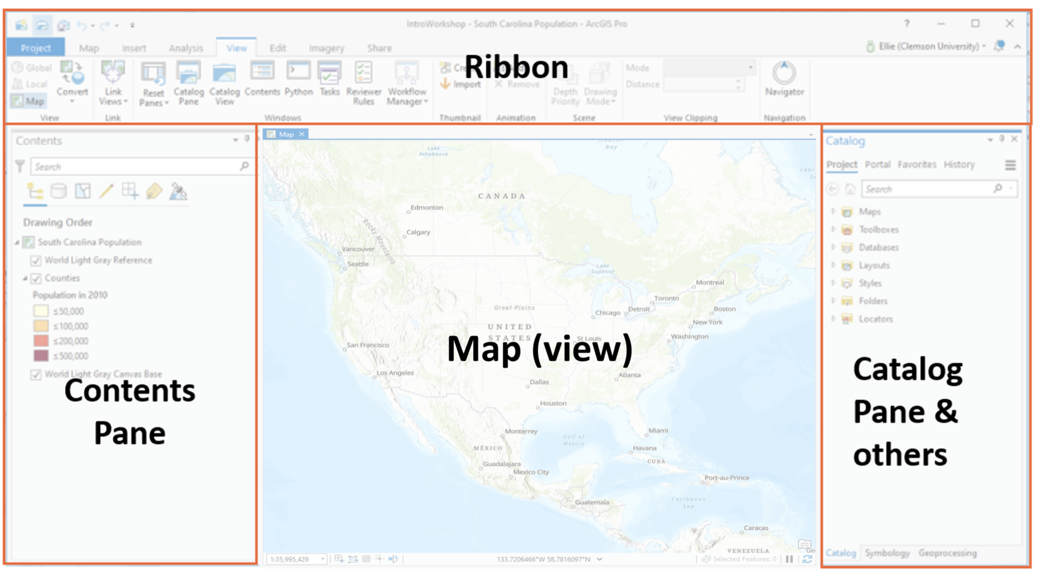
Above the map view is the ribbon (where the magic
happens). The ribbon has a set of core tabs: Map,
Insert, Analysis, View,
Edit, Imagery, and Share that are
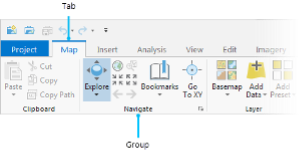
always present when a map view is active. Each tab has its own set of
tools, organized in groups. The Map tab has tools for
interacting with the map. For example, under the Map tab,
the Explore tool is located in the Navigate
group.
Specifically, the Explore tool allows you to move around
the map and to read information about map features of interest. You can
familiarize yourself with these tools by simply hovering over these
buttons. For example, The Full extent tool allows you to
zoom out to the full extent of your dataset,
the blue arrows below it brings you back to your previous
extent.
Instead of using ribbon button, under the Map view, you can also use your mouse to move around map view or gather information such as the latitude-longitude coordinates (the mouse pointer’s location are displayed at the bottom of the map view). You can also use the mouse wheel to zoom in and out.
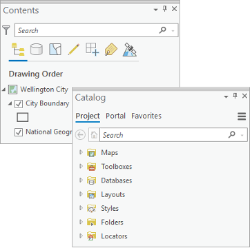
In addition, you may see a Contents pane, a
Catalog pane, or both. Panes are additional windows that
ArcGIS help you manage views and projects. They are basically separate
interfaces offer you access to specific functionality of the
software.
They are very important and sometimes need to be kept open all the time. Panes in ArcGIS are very flexible, you can open, close, move, dock and hide them based on your preferences. You can always play around them yourself.
When you accidentally close them, don’t panic, you can go to
View —> Windows and you can turn on the
them again. Noticing there are more panes to come, we will get to know
them later in our course!!
As you work, you’ll often open and close panes that you need for
specific tasks. You may also want to re-position panes or minimize them
to make room for maps and other views. On the ribbon, click the
View tab. In the Windows group, click
Reset Panes and click
Reset Panes for Mapping (Default). And voilà, they will be
back to default look.
The two panes can be docked on either sides of the ArcGIS Pro window.
They can also stacked on top of the other. If the panes are stacked,
they have tabs at the bottom that allow you to switch from one pane to
the other. You can also autohide a pane by clicking the
![]()
The Contents pane lists items in the active view, such
as layers in a map or layout elements in a layout. The
Catalog pane lists items that belong to the project, such
as databases, toolboxes, and folder connections. The
Catalog pane also provides access to portal items, such as
web layers.
Useful ways to personalize ArcGIS Pro
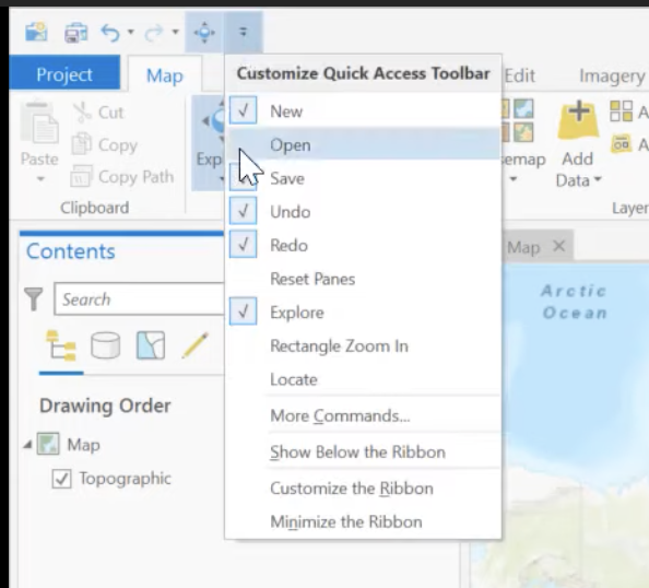
Quick access toolbar
Quick access toolbar located above ribbon provides easy access to common commands.
From the Curtomize Quick Access Toolbar you can add and
remove different commands based on your needs.
You can also add a tool to the quick access toolbar by right-click the tools located in the ribbon.
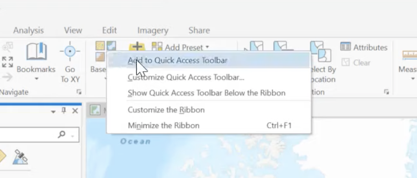
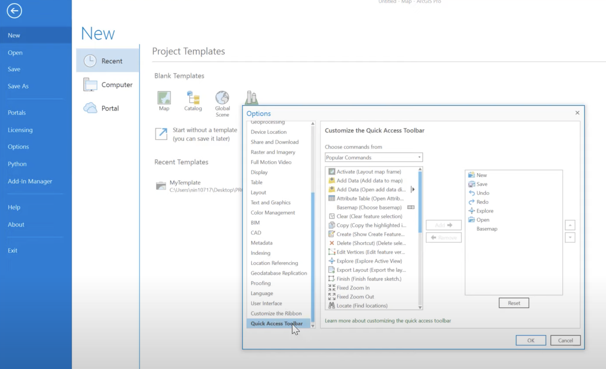
You can also editing the quick access toolbar by going to the very
end of the Options list under project tab,
Search and add your favorite tools.
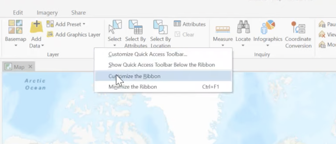
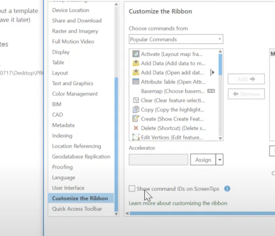
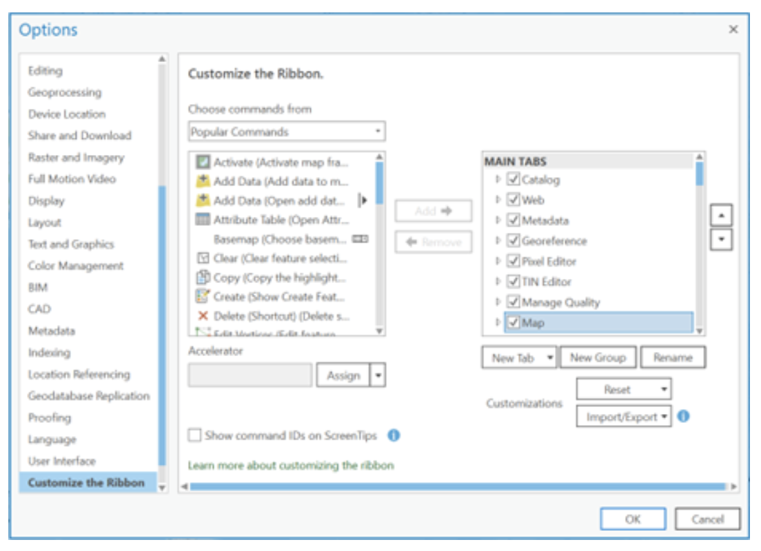
Customizing the ribbon
We can add new tabs and new groups and add new commands to those tabs
based on your needs. Right-click the ribbon and choose
Customize the Ribbon.
Another way of doing it is the same by going to the
Options list under project tab, where you can
choose to customize your ribbon.
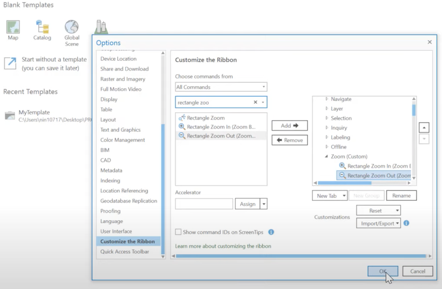
For example, you can select the Map tab and select add a
New Group (see below). You can name your new group
Zoom and from the left of the window you can select Choose
commands from All Commands and search for
Rectangle zoom and you can add the related tools to your
new group.
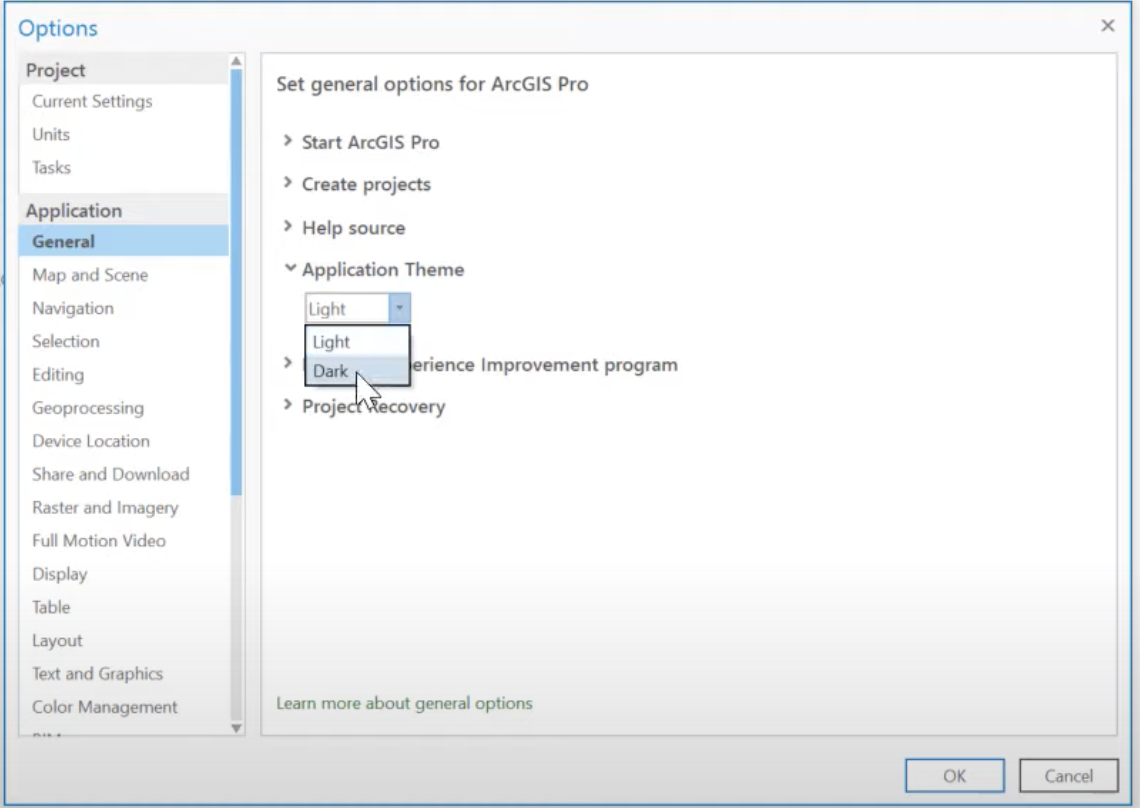
Changing the application theme
You can switch between dark theme and light theme. Simply by going to
the Options under Project. Go to
General under Application. You can make your
choice under the Application Theme.
Some basic tools under Map tab
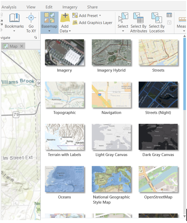
Add basemap
You noticed that a Topographic layer was automatically added when you opened the project. If it doesn’t match your taste or is too cluttered, you can either change or close the base map. ArcGIS Pro provides different Basemaps in addition to the default World Topographic Map.
Simply go to Map tab, under Layer group,
click Basemap. In the Add Basemap dialogue
box, you have a number of options. Select one you preferred.
Find location
ArcGIS Pro allows you to locate a place within the basemap. It
functions like a Google map. Simply under the Map tab, go
to Inquiry group, use the Locate
tool![]()
Add data
Adding data is an important step for our lab. There are two ways to add data in ArcGIS Pro: local data and online data. The new ArcGIS Pro is integrated with ArcGIS online, a cloud-based tool that users can upload datasets to, which makes it more powerful. You can search and add data that is uploaded and maintained by other users in the ArcGIS cloud.
To add an ArcGIS online portal connection, complete the following steps:
- Click the
Projecttab on the ribbon and click thePortalspage. You can also access thePortalspage from theManage Portalslink in theSign Inmenu. - Click
Add Portal. Enter the URL for the portal on theAdd Portaldialog box: https://cugis.maps.arcgis.com and click OK. - Optionally sign in to the portal. Click the
Options
portaland click Sign in. Enter your Cornell username and password. - You can also sign in portal using web browsers.
To make the new connection your active portal, right-click the URL
and click Set As Active Portal. Now, you are ready to add
data online. Back in the map: On the Map tab-Layer group,
click Add Data and click Data. In the Add Data
dialog box, select ArcGIS Online.
Now let’s add a few data from ArcGIS Online. In the
search ArcGIS Online box, lets search for
- Tompkins County parcel: in this case use Parcels_Public for now (Tompkins county tax parcels);
- TCBuildings: TCBuildings_Edit (Tompkins county Building footprints);
- TcStreets (Tompkins county streets);
- TCMunis (Tompkins county municipal boundaries).
The search allows for fuzzy matching, the name might not be exactly the same, but choose the one with the latest date. Also pay attention to the owner, data is more credible if it is provided by government agency.
Now, let’s add the data from your local drive. Navigate to your drive under Project/Folders and add the data from your lab_1 folder for - polling_places13 - polling locations
Basic layers/data editing
Layers display on the Contents pane
change display order
Note that the Contents pane includes several options of
displaying layers: List by Drawing Order or
Source etc. You are able to turn the various “layers” on
and off, as well as rearrange the order in which they are presented by
“clicking” and “dragging” the layers. When you drag layers, a black line
appears just above the layer you are about to move. Move this line until
you reach the new position for the layer and let go of the mouse button
to drop the layer there.
Now let’s rearrange the order of layers from the top to the bottom as polling_places13, TcStreets, TCBuildings, Parcels, and TCMunis.
rename layers
The current names are not particularly helpful. Let’s change layer name so they are understandable (note: sometimes you may have to open the attribute table and look for clues to determine what a more appropriate title should be).
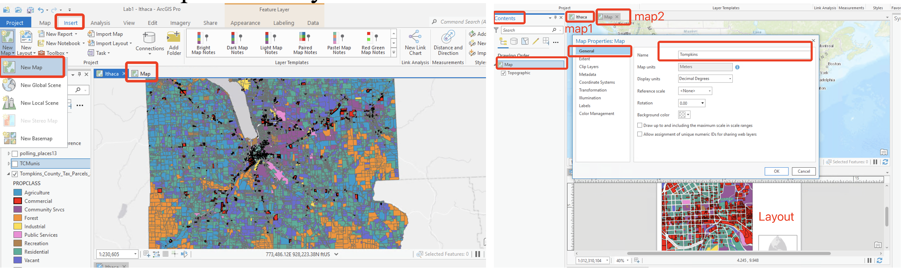
- First, give our Map a name. In the
Contentspane, right click on theMapand go toMap properties. Under theGeneraltab, change the name to ‘Ithaca’. Click OK. (Or simply left click it.) - Right click on “TcStreets” layer and select
Properties. In theLayer Propertiesdialog box, select theGeneraltab. - Under
Nametype “Tompkins County Roads” and hit OK. - Change so the others read as follows (or whatever you like):
- TCBuildings: Building footprints
- TCMunis: Municipal boundaries
- polling_places13: Polling locations
- TcStreets: Tompkins County roads
- taxparcelsrps: Tompkins County Tax Parcels
Remember that you are not really changing the name of the original layer files, only the name displayed in ArcGIS Pro.
The attribute table
By right clicking on our tax parchel layer in the
Contents pane, you can access the
attribute table (check other functions/shortcuts under the
right clicking drop-down menu). A table view opens with the parcels
layer attributes, which will contain the attribute information about
this layer.
The attribute table is a spread sheet file in which rows represent observations/cases and columns represent variables/attributes. Or to put it differently, the rows correspond to features (in this case polygons that correspond to parcels) and the columns correspond to the attributes of these spatial features. There is a one-to-one link between the features in the map and the rows in the table. This allows users to retrieve attribute information about any feature in the map. It also allows users to display one or more attributes for each geographic feature and easily create maps of particular attributes.
The first column in the attribute table (FID) is a Feature ID, which assigns a unique number to each feature, starting from zero. The FID is assigned automatically by the GIS system and cannot be changed.
The last column in the attribute table shows the type of feature (in this case polygons). Any given shapefile can only hold one type of feature (i.e. points, lines or polygons) and cannot combine different feature types.
The other columns all contain various attribute information. Some of these are recognizable, while others are probably not, and will require an examination of the metadata to determine what they represent.
Now, let’s do some statistics.
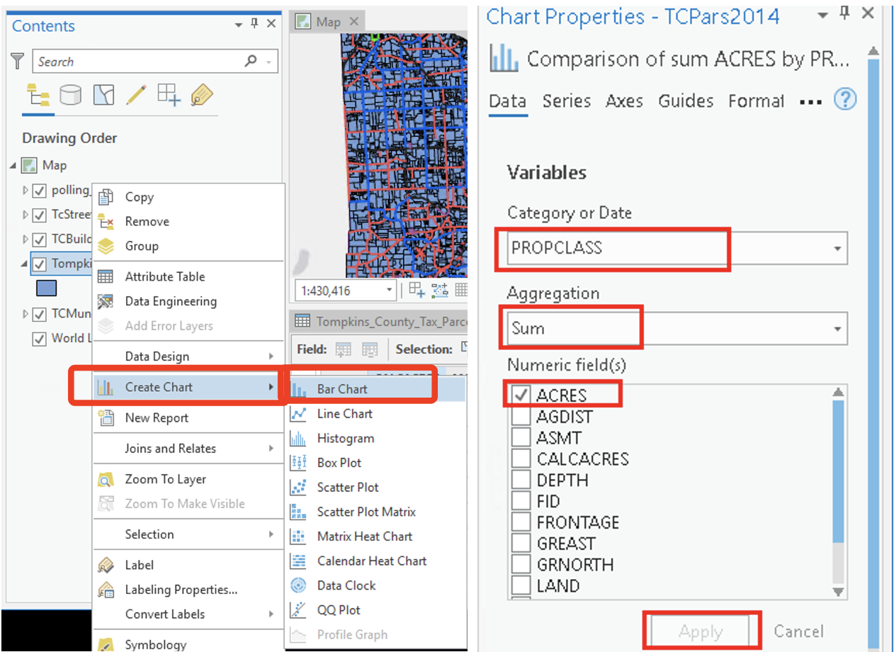
Right click on the “Calcacres” column heading and go to
Statistics. This will display a basic frequency
distribution of parcel size. The output is not particularly helpful. Now
let’s go back and right click on the layer of tax parcels and go to drop
down menu of Create Chart/Create Bar chart. Under the
Chart Properties, select PROPCLASS as the
Category or Date, SUM as the
Aggregation, and CALACRES as the
Numeric fields. This produces a more useful chart of
acreage according to the property class. We could then export this chart
as an image file using the Export button.
Basic Mapping
Mapping symbology and label
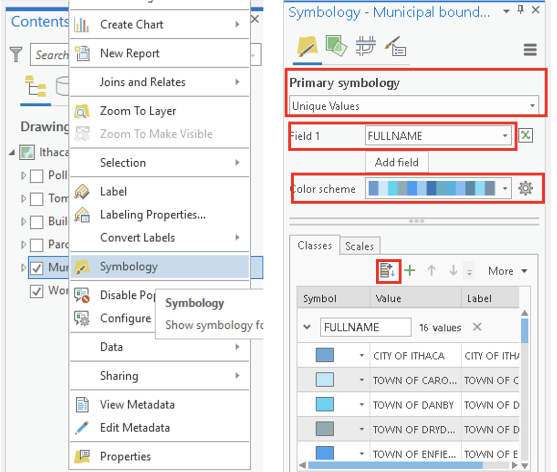
Symbology
Turn off all layer except for Municipal boundaries. Right click on
Municipal boundaries layer and take a look at the attribute table. Note
that while each municipality has a Name, these are often
duplicate and contingent on the MUNITYPE (City of Ithaca,
Town of Ithaca, etc.). The attribute FULLNAME will give us
a unique name for each polygon.
Close the table, right click the Municipal boundaries layer again and
click on Symbology which will open the
Symbology panel. Let’s create a unique values
map using the attribute FULLNAME. Under
Primary symbology, go to unique values. For
Field 1 choose FULLNAME, then click the
add all values button![]()
Color scheme that is
currently selected. If you click on the down arrow for
Color scheme, you will find many other choices. Select one
of your choices.
If you want to edit a particular feature (for example a particular
polygon), you can double-click on it. For example, you can double click
on City of Ithaca and change its color individually (Note
that the symbol selector also includes pattern symbols in addition to
solid colors).
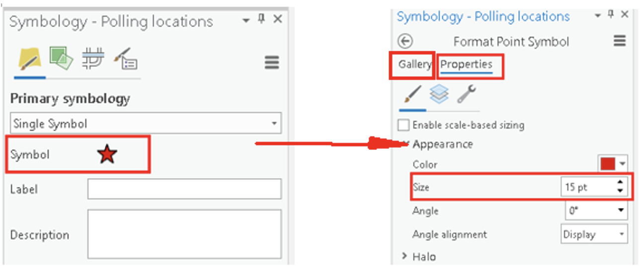
Adjusting Symbology
Let’s adjusting the symbology of other features. Right click on the
Polling Locations, and select Symbology. Change the points
to stars (note that you can adjust the color and size as well).
You will note that several of the layers from ArcGIS online were
added with their symbology already classified. For example,
streets are already classified according to the
Maintenance variable, and Buildings are
categorized according to type (BTYPE).
Right click on the Parcels layer and go to
Symbology. In the Symbology dialog box, select
unique values as the primary symbology,
PROPCLASS as the field. We now have created a unique value
map of parcels categorized according to property type.
Please see here for an extensive tutorial on Symbology in ArcGIS Pro.
Creating Labels
Close the Symbology pane. Again, right click on the
municipalities layer in the Contents pane and go to the
Labeling properties. In the Label class pane,
notice the default attribute (Name) under the
Expression box. Delete this and identify
FULLNAME as the appropriate field (this will specify to
ArcGIS which attributes to use for the labels). Note that within this
dialog box you can adjust the label style and placement properties of
the labels. Click Apply. Back in the contents pane, right
click on the municipalities layer, and click
Label – the name of each municipality will now appear in
the map.
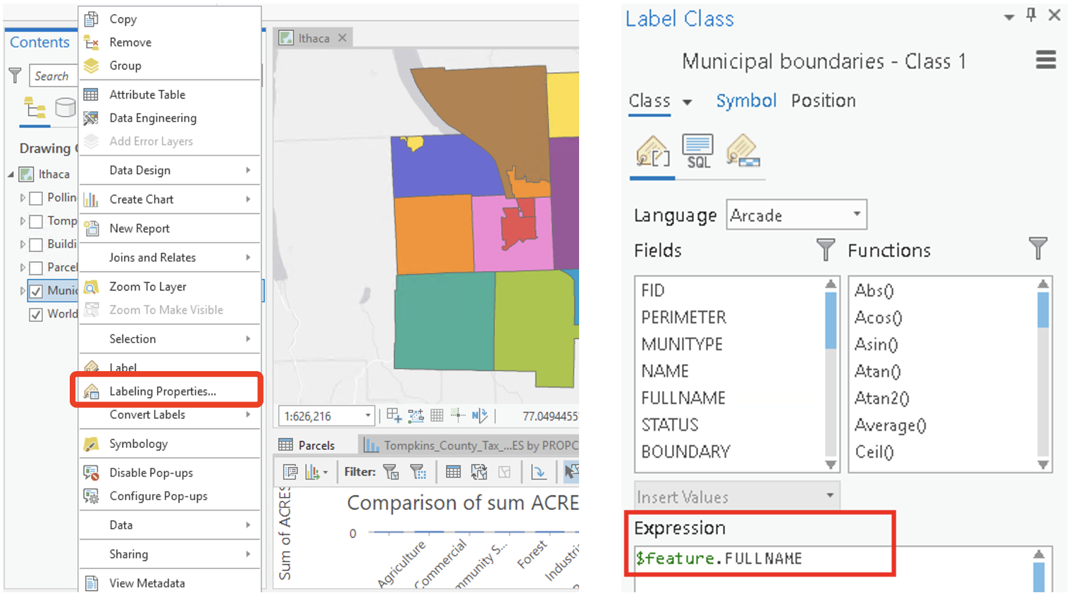
You have now created a unique value map for Tompkins County municipalities. Click here for extensive tutorial on Labels in ArcGIS Pro.
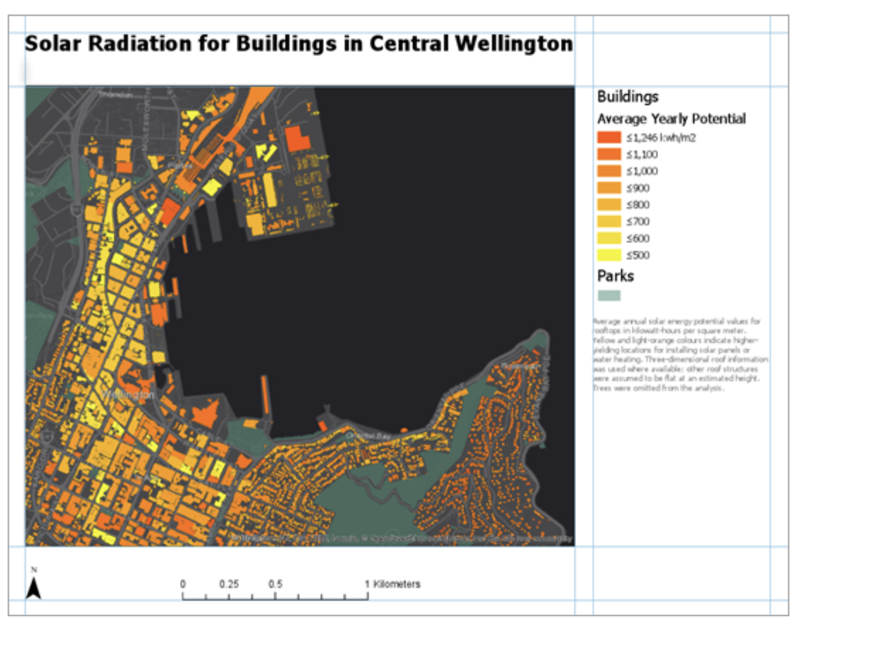
Mapping layouts
Now we will come to the final steps of mapping. We will now create a map layout. For this layout, we will include a zoomed view of downtown Ithaca that displays streets, parcels, and polling locations with a context map of Tompkins County that has all the municipal boundaries labeled with municipal names included.
Most importantly, these are the basic elements you should include to your map layout every time you create a map!!!
- Title (and sub-titles if necessary)
- Legend (Is it legible? Does it make sense? Are the titles coherent? Do the number breaks make sense?)
- Metadata/notes (tell us about the map! Who created it? Where? Date? What is the data source? Projection? Units? How is the data classified? What is the purpose of the map?)
- Scale bar (Do units (feet, miles), breaks (not too many!) make sense?)
- A north arrow
Now, let’s get our “hands dirty”.
Creating a layout.
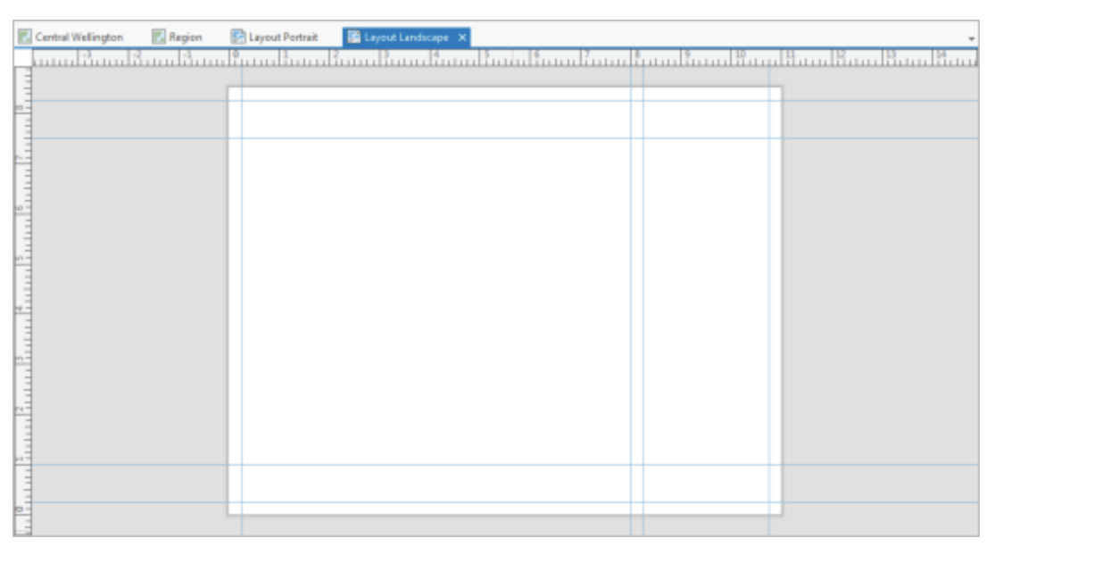
The first step in making a page layout is to insert a blank layout.
On the ribbon, click the Insert tab. In the
Project group, click New Layout to show page
size and orientation options. Under ANSI - Portrait, click
Letter (this is a matter of preference). A new, blank
layout view opens.
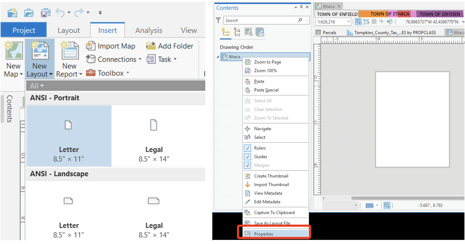
Let’s give the layout a name. In the Contents pane of
layout view, right-click Layout and click
Properties. On the Layout Properties dialog
box, tag General, change the name from Layout
to Ithaca.
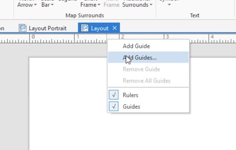
Add a guide
Guides are non-printing lines that help you align elements on the
layout. It is a great tool to facilitate your map design. Right-click
the top ruler and click Add Guides.
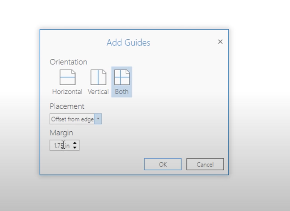
On the Add Guides dialog box, under
Orientation, click Both. Click the Placement
drop-down arrow and click Offset from edge. Replace the
value in the Margin box with 0.25 in. Click OK. Now, guides are added to
the layout at one-quarter inch from each margin.
You can add multiple guides or single guide (Click the
Add Guide not Add Guides) to help the design
of your layout. The effects should be similar to the example showing
below. You can place your layout elements (legend, north arrow, text,
etc.) into corresponding part of the layout partitioned by your
guides.
To move an existing guide, drag it from its current position on the
ruler. To delete a guide, hover over the ruler at the location of the
guide. Right-click the blue triangle that appears and click
Remove Guide. Try it yourself.
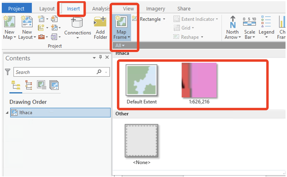
Insert a map frame
Now let us create a map frame in our layout. Under the
Insert tab, click the Map Frame
drop-down arrow. Select the frame with your data
(usually not the first one, the first one is the
default). Use your mouse to draw a large rectangle on the
layout page. The map frame is added to the layout. It is currently
selected, as indicated by selection handles. This will allow us to move
it around the page to position it correctly.
Right click inside the frame and select Activate (this
can also be accessed through the Layout Tab at the top as well). This
will allow you to manipulate the map data within the layout frame and
select the correct size and position for your data.
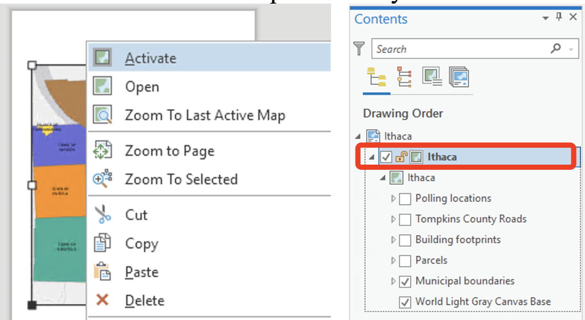
Again, in the Contents pane, right-click
Map Frame and click Properties. In the Map
Frame Properties dialog box, click the General
tab if necessary. Change the name to Ithaca. Notice at the
top, we can toggle between the layout view and the map
view:
In the layout view, Zoom in to the downtown area by using mouse wheel (remember you have to have the map frame activated. The symbology of the polling places should be red stars. The symbology of the streets should be a single symbol. The symbology of the parcels should be categorized according to property class.(What we have done before)
To close an activation session to avoid unintended changes, go to
Activated Map Frame Layout tab, click on the
close activation![]()
red-cross on the
top-right of your layout frame.
Add a second map frame (context map)
Let’s create a context map. Under the insert tab, add a
New Map. Note that insert a map, not a layout frame!!! In
the Contents pane, under Drawing Order,
right-click Map and click Properties. In the
Map Properties dialog box, click the General
tab if necessary. Change the name to Tompkins County.
This time, add only the Municipal boundaries layer to this map frame. You can do it like this:
- Go to Ithaca map, right click on the Municipal boundaries layer
- Select
Copy - Go to Tompkins map, right click and select
Paste
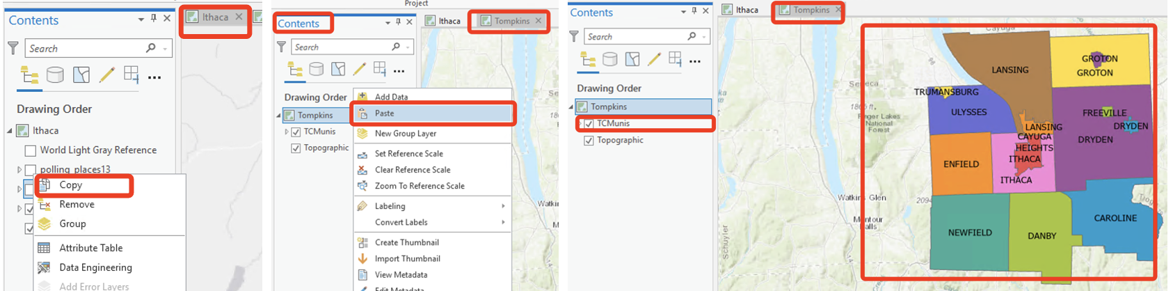
Re-title the layer and create labels for their full names (feel free to experiment with placement and stylistic considerations).
Now, add a second Map Frame to your Ithaca layout to
display the Tompkins County map (To do this, you need to de-activate
your previous layout session, follow the steps we showed in the previous
part, think through it yourself.)
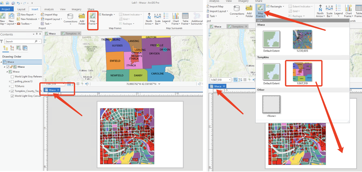
Within the contents pane of layout view,
rename this second Map frame Tompkins County.
Adding data frames is useful if you wish to include overview/context maps, or to display maps of different variables in the same layout (e.g. for a poster presentation). You can individually adjust each of the map frames on the page. To do that remember to activate and de-activate different map frames.
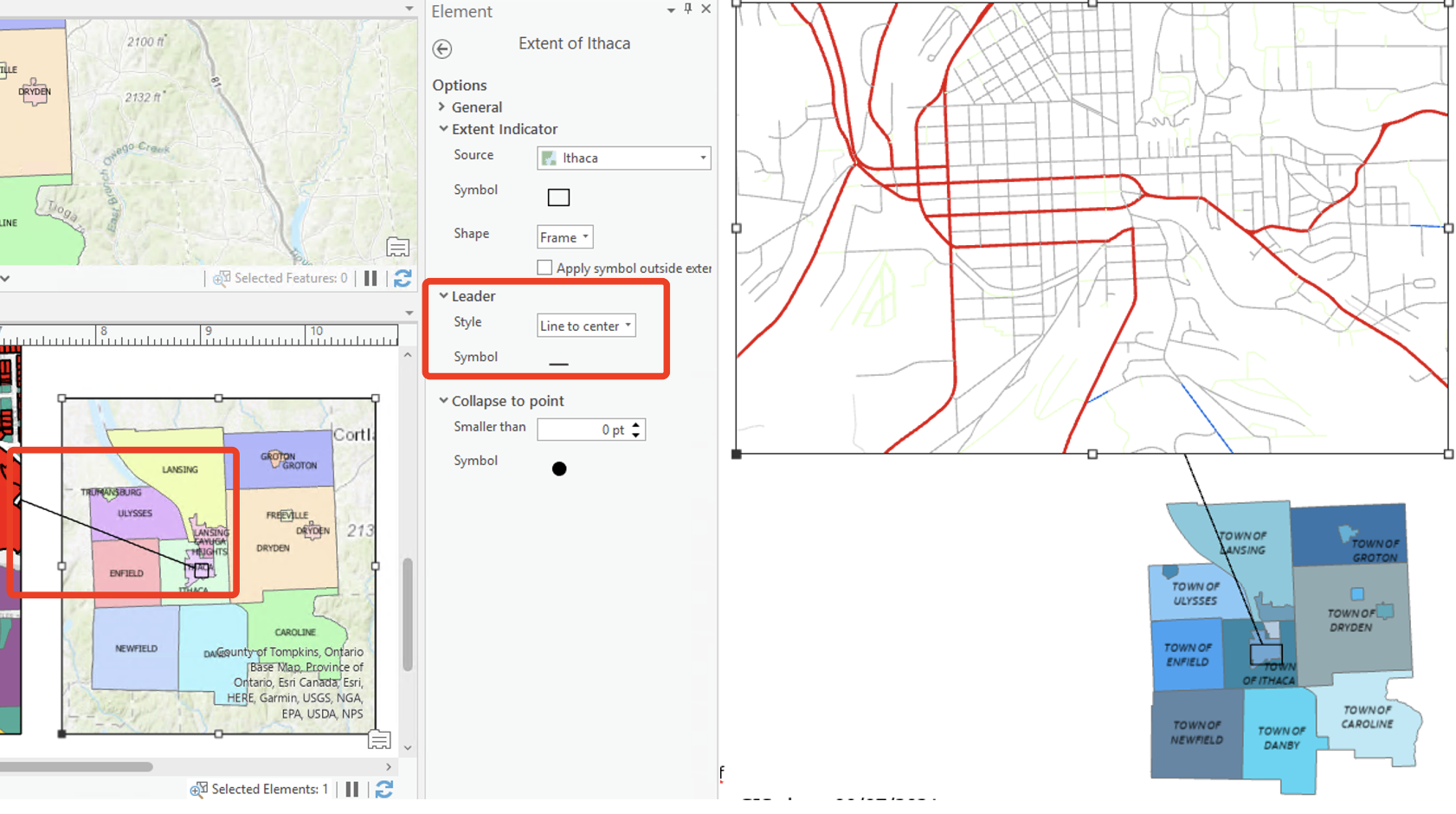
Add map extent indicator
Let us include a extent indicator to indicate the relationship between the two map frames.
On the Insert tab click the
Extent Indicator drop-down arrow and click
Ithaca. In this case, you must first click the
Map Frame of Tompkins County in order to choose Ithaca in
the Extent Indicator. (You must be clear what kind of relationship you
want to indicate among these maps! In this case, the relation is
containing. So indicator is from Tompkins County to Ithaca!)
Open (right click) the properties for
the Extent of Ithaca and the
Format Extent Indicator pane appears.
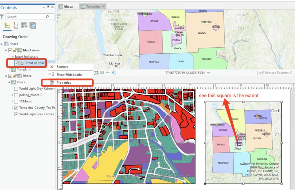
In the Format Extent Indicator pane, you can select an appropriate
symbol for the extent map. Under Extent Indicator, check
the Apply Symbol outside extent tab, and for
Leader style select Line to center. You will
find a line linking between the source map frame and the extent
indicator.
Add map layout elements
Now we come to the final steps of making a map! We will add a legend, north arrow, scale bar and a text note to the layout. The legend explains the map’s symbology. The north arrow and scale bar provide geographic context. And the text note provides the metadata of your map. (Before adding all the elements, remember to de-activate the layout.)
Insert legends:
Before inserting a legend, spaces and any extraneous or unnecessary
symbols or icons should be removed. You will also want to take this
opportunity to delete unnecessary elements (for example, parcels contain
a field for ’All other values”, which is not particularly useful in a
legend. Also, there are missing values in this layer, delete them for
now. Open the Symbology for the parcels layer, and adjust
(i.e., delete) both the Symbology and the text
for this category (Just right-click and Remove). For this
particular map, the legend should include the property classes, streets,
and polling places. Remember, do not use the ArcGIS default
setting for your legends!
Now, let’s insert the legend. Under the Insert tab,
click Legend. On the layout, anywhere suitable on the map
frame, draw a rectangle using your mouse for your legend. To work with
the properties of the legend as a whole, right-click the
Legend heading in the Contents pane and click
Properties (Alternatively, right-click the selected legend
on the layout). We are interested in displaying a legend for the
‘Ithaca’ map frame (not Tompkins County).
Note you can select which Map frame’s legend to show
here. Try cleaning up the legend so that only the most important
information is showing. Click the Show Properties
and have a look at all those options under Show, normally,
you don’t need show both layer name and headings.
Also, under Feature Display Options, select Only
show features visible in the map extent. This will help your legend
looks efficient!.
Note: If you want to further adjust and clean the legend, you can convert the legend to a graphic and manipulate the legend independently (But remember only resort to this method if you desperately need to customize your legend!!). You should only use this function if the tools in legend properties window are not sufficient. Once you convert your legend to a graphic it is no longer connected to the data, which means the legend will no longer reflect changes you make on your map, e.g., it will not add new layers or reflect changes in colors.
The steps are as follows if you want to further customize your legend:
- Right Click on the legend and choose
Convert to Graphics. - Right Click on the legend and choose
Ungroup. You now can move and edit all of the elements of the legend independently. - When you are done with your edits, click the mouse and drag a
rectangle over all of the elements of your legend to highlight all of
them. Right click and choose
Group.
Insert scale bars:
Same as above, never simply accept the default if it is not easy to read and to use! There are some general rules for scale bars:
- Use appropriate understandable units based on the scale of your map. For example, for the downtown Ithaca map, feet may be appropriate. For the Tompkins County data frame, miles may be appropriate.
- Don’t use arbitrary number as breaks, uses whole numbers such as 0.25/0.5/1/2.
- The fewer the divisions, the better.
We can grab the end and extend the scale bar so that it includes more
obvious break points. Also in the Format scale bar panel,
you can adjust the number of divisions. Also note that we can adjust the
map units as well as the map frame.
Insert text:
Next, you’ll add a map title and some descriptive text. On the
Insert tab, in the Graphics and Text group,
click the Rectangle text
tool![]()
Format text panel, edit the font size, style and color
(Under text symbol/properties) Alternatively, On the ribbon, under Text,
click the Format tab. Adjust the font, style and size
appropriately.
You can add multiple text boxes. Remember to add an appropriate title (short, concise, direct) and sub-title (if necessary) and a text box for meta data. When you’re finished, click an empty area on the layout. It also typical to include a text box with name, date, data source and projection information, as well as other pertinent information. For now, name and date are fine. Insert a north arrow
DIY: Size and place it on the layout accordingly.
Export the layout
Now that your layout is finished, you can print it or export it to a
file that can be easily shared. On the ribbon, click the
Share tab. In the Output group, click
Export Layout. The Export Layout pane appears. On the
Properties tab, change File Type to PNG, JPEG or TIFF necessary. In the
Name box type lab_1 or something similar. Click Browse and
browse to the location where you want to save the file (Your document
sub-folder within your lab folder). At the bottom of the pane, click
Export. When the export is completed, click
View exported file at the bottom of the pane. The file
opens in your default image viewing application. You can also print your
map layout if you want.
Now it’s your turn!!!
The first assignment includes two parts:
Part One: Making Maps (60 pts)
- A clean, well-organized map depicting parcels classified according to property class, polling places and streets for downtown Ithaca, plus a location map depicting municipalities for Tompkins County (i.e., the map we just produced). Make sure you include north arrow, scale bar, title, and text box with name, and date. 15 points
- Create a unique value map of all parcels in Tompkins County categorized by School District. Include roads and change the symbology so the state routes (NYS DOT) stand out. Since we are including all of Tompkins County, no need for a context map. 15 points
- Create a unique values map of Downtown Ithaca buildings categorized by building type. Change the symbology so that you highlight the buildings categorized as commercial and retail. Meanwhile, please include Tompkins County context map this time. 15 points
- A map of polling places labeled with accompanying addresses for the City of Ithaca. Include roads and context map. 15 points
Part Two: Critiquing a Map (40 pts)
Maps are all around us, and they can be a great source of inspiration. However, they can also be misleading (as Monmonier argues in his 1991 classic How to Lie with Maps )
Find a map and critique it. To assess the effectiveness of the map, answering the following questions (Remember to include the reference to the map):
- Do you like the map? Why or why not?
- Is the map misleading in anyway? Does it exaggerate the key point?
- Is there extra information that distracts your attention from the data or makes the map “look better”?
- What visualization techniques from this map would you like to use in your own maps? What would you change?
The END