Lab 8: Network Analysis
Xiaozhong Sun
2023-05-07
Due Date: March 29th
Instructor: Xiaozhong Sun (xs243@cornell.edu)
Lab TAs: Wenzheng Li (wl563) / Ishan Keskar (iuk3) / Aditi Parihar (ap973)
Location: Sibley 305, Barclay Gibbs Jones Computer Lab
Total Points: 100
Goals for this lab
For this lab we will need to utilize a network dataset. A network dataset is an intelligent model of the road system. It contains not only the location and attributes of roads but also information about how roads relate to one another, such as which roads are connected, which turns between connected roads are allowed or prohibited, and other information that affects what travel paths are possible, and how long travel takes. A networked dataset can be created from a georeferenced street network polyline file. To learn how to do this, click here. For the purposes of this lab, we will provide you with a readily available networked data set.
Please remember to open a new map session for each part of the lab!
Identify the closest facility
The closest facility solver finds one or more facilities that are closest to an incident based on travel time or travel distance, and outputs the best routes as driving directions between the incidents and the chosen facilities.
Open ArcGIS Pro. Create a new project for this lab.
In the Catalog pane, navigate to your folder and expand
SanFrancisco.gdb and Transportation. Drag
SanFrancisco_ND![]()
Using the on-the-fly method, set the projection to match California State Plane. Not sure which zone to use for the San Francisco Bay area? Look it up.
By default, network datasets built with traffic data show traffic conditions for the current time when they are added to the map. This network dataset includes historical traffic, so you are seeing typical traffic conditions for the current time and day of the week.
Now go to the data folder and add the hospital layer.
Create the closest facility layer
The closest facility analysis layer stores all the inputs, parameters, and results of a closest facility analysis.
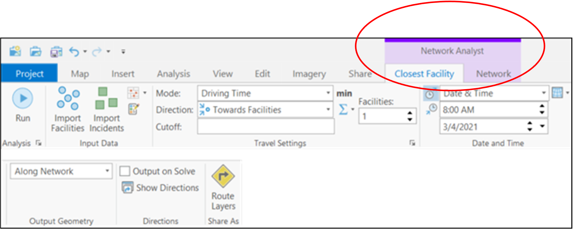
On the
Analysistab, clickNetwork Analysis—>Closest Facility
If you click Closest Facility in the Contents pane, the Closest Facility tab appears in the Network Analyst group at the top of ArcGIS Pro. Click Closest Facility to see the tab’s controls. You’ll use these controls to define the closest facility results you want to generate.
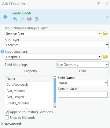
Now you want to add facilities to your analysis. You’ll use the Hospitals feature class to load the Facilities sublayer into network analysis class. To do so:
- On the
Closest Facilitytab, clickImport Facilities. TheAdd Locationswindow appears. - Make sure
Input Network AnalysisLayer is set toClosest FacilityandSub Layeris set toFacilities. - Click the drop-down menu below
Input Locationsand chooseHospitals. This is the point feature class you previously added to the map. - Leave the default settings for the rest of the parameters. Click Ok.
A total of 9 hospitals loads as facilities. Then we need to add an incident. Consider an accident site as an incident. The closest facility solver finds one or more hospitals that are closest to the accident location.
Find the incident layer in the data folder and add it to the map.
Under Closest Facility, click the Import Incidents
button, set sub layer to Incidents and
Input Locations to Incidents. Click Ok.
The address is added to the Incidents sublayer of the
Closest Facility analysis layer.
Set up properties for the closest facility analysis
The Closest Facility tab includes a
Travel Settings section, where you can specify properties
for the analysis.
- In the
Travel Settingsgroup, in theFacilitiestext box, increase the value to 3. The closest facility solver will search for a maximum of three hospitals from the accident site. - In the
Cutofftext box, type 5. The closest facility solver will look for hospitals that can be reached within 5 minutes from the incident site. Hospitals outside the cutoff time are ignored. Since the current impedance isTravel Time, the units are in minutes. - From the
Directiondrop-down list, selectTowards Facilities.
Now run the process to identify the closest facilities: go to the
Directions group, check the Output on Solve,
which will generate directions upon solve.
- Click Run
When the solve process is complete, routes appear in the map display
and in the Routes sublayer of the
Closest Facility group layer.
- In the
Directionsgroup, clickShow Directions
Finding the best route for the given order of stops based on travel time
Creating the Route Analysis Layer
On the
Analysistab, in theWorkflowsgroup, clickNetwork Analysis–>Route
Contentspane. This could take a few minutes.The Network Analyst Window now contains empty lists of Stops, Routes and Barriers categories: point, line, and polygon. Additionally, the Contents pane contains a new Route Analysis Layer.
- The route is referencing the San Francisco network dataset because the network was in Contents when the route layer was created.
Note: To see or change the network data source that will be used to create the network analysis layer, you can click the
Network Analysisdrop-down menu and look underNetwork Data Source.
- Click
Routetab on top to see the control settings. You will use these controls to define the route you want to generate.
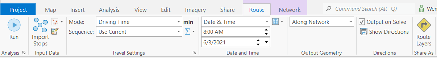
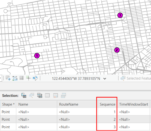
Now let’s add a Stop. You will add the stops between which you will be creating the best route.
- In the
Routetab, under theInput Datagroup, clickCreate Features
- Under
Route: Stops, use the Point tool
- The program then calculates the nearest network location and symbolizes the stop with the located symbol. The stop will remain selected until another stop is placed or until it is unselected.
- Add two more stops on the map.
- On the
Edittab, clickAttributes
Selecttool and edit their attributes, such asNameandSequence. Sequence helps to change the order in which the stops will be visited. Specify a visiting order for the three stops, and you will also find the numbers you assigned appears on each stop in the map.
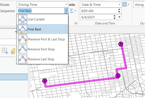
- On the
Routetab, clickRun. The results show the fastest path through the network, connecting all the stops you created based on the sequence you specified. - To create a route that finds the best way to visit all the stops
(also known as the traveling salesperson problem) regardless of
the order, on the
Routetab, in theTravel Settingsgroup, choose theSequencedrop-down menu and select theFind Bestoption. ClickRun. The resulting route will now show the best sequence to visit all the stops.
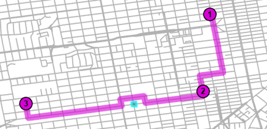
Adding a Barrier
In this section, you will add a barrier on the route that represents a roadblock and will find an alternate route to the destination, avoiding the roadblock.
- Under
Create Featurebutton, selectRoute: Polygon Barriers, clickPolygon Barriers.
- Use the
Polygontool
- On the
Routetab, clickRun.
The map now shows a different route that avoids the area covered by the barrier you created.
Map 1: Create a map layout of your route with stops and barriers. Include at least streets and shorelines. Symbolize appropriately. Include all the elements you deem necessary.
Calculating service area
Next, we will create a series of service area polygons, which represent the distance that can be reached from a facility within a specified amount of time. We will calculate 3-minute and 5-minute service area polygons for hospitals in San Francisco (A more accurate measurement than distance buffer).
- On the
Network Analysttoolbar dropdown menu, clickService Area. The Network Analyst Window now contains an empty list of Facilities, Barriers, Lines, and Polygons categories. Additionally, the Contents pane contains a new Service Area analysis layer.
Click Service Area to see the tab’s controls. We’ll use
these controls to define the service area you want to generate:
Think of a facility as the starting location of a vehicle. The service area solver simulates all possible paths the vehicle can travel within an elapsed time when departing from the facility.
Since ambulances are typically parked at hospitals, we first load the hospitals into the Facilities sublayer.
- On the
Service Areatab, in theInput Datagroup, clickImport Facilities
Add Locationswindow appears. - Make sure
Input Network Analysis Layeris set toService AreaandSub Layeris set toFacilities. - Make sure Hospital is set to input locations.
- Leave the default settings for the rest of the parameters and click OK.
Open the attribute table of Facilities, we can find there are 9 hospitals are added as facilities.
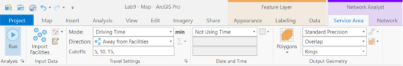
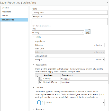
Now we will set the service area. In the Travel Settings group, change the Cuttoffs value to 3, 5 (Enter this as 3, 5 –the numbers are separated by a comma, without the quotes). This indicates 2 separate service areas.
We can also reset the properties of the network we built. In the Travel Settings group, click the icon

Nonefor the U-turns at Junctions. The rest of the dialogue box should look like the figure below.
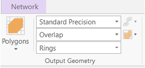
Now under the Output Geometry group, make sure that
Polygonsis checked. Select Standard Precision. This results in faster analysis. Detailed polygons are much more accurate but need more time to be generated.Under Multiple Facilities Options, select
Overlap. This creates individual polygons per facility that may or may not overlap. Pay attention to the Dissolve and Split type. Dissolve merges the polygons of multiple facilities that have the same cutoff values into one polygon. Split creates individual polygons that are closest for each facility.Click Rings for the Overlap type. This excludes areas of smaller breaks from the polygons of a bigger break.
Run the Process to Compute the Service Area: Click the Run button on the Service Area tab. The service area polygons will appear on the map.
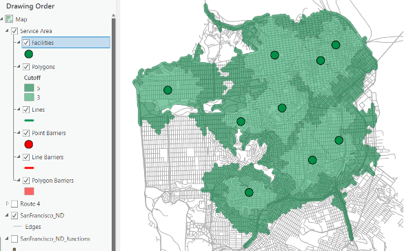
Map 2: Create a map layout depicting 3-minute and 5-minute service areas. Provide a short analysis of what you have just created – what are the benefits of creating service areas verses using the buffer tool. Note: we were able to create this because we had travel times for each road segment. This may not always be the case. You may have to rely on distances in some occasion.
Identifying the service area polygon that each library lies within
Now we will determine which libraries fall within which service areas of Hospitals.
We will first create a spatial join between libraries and service areas.
Load the Library shapefile. Right-click the
Librarylayer and select Joins and Relates then Spatial Join…Set “Service Area/Polygon” as the join feature. Select
withinas the Match Option so that the attributes of the polygons (service areas) will be joined to the libraries that fall inside the polygon. Should you use “Join one to many” or “one to one”? It is up to you. Click OK.Open attribute table for the newly added spatial join shapefile. Each row displays the name of the Library and Hospital service area it falls under.
Creating an OD cost matrix analysis layer
The origin-destination (OD) cost matrix solver finds and measures the least-cost paths along the network from multiple origins to multiple destinations. The best path on the street network is discovered for each origin-destination pair, and the travel times and travel distances are stored as attributes of the output lines.
Now let us create an origin-destination cost matrix for the driving time between libraries and hospitals (for emergency planning). The results of this matrix can be used to identify libraries that will be serviced by each hospital within a 10-minute drive time.
Load the Library and Hospital shapefiles.
Click
Network Analyston the Analyst tab and clickOrigin-Destination Cost MatrixThe OD cost matrix analysis layer is added to the
Network Analysttab. The network analysis classes (Origins, Destinations, Lines, Point Barriers, Line Barriers, and Polygon Barriers) are empty. The analysis layer is also added to theContents pane.Go to the OD Cost Matrix, click Import Origins

Input Network Analysis Layeris set toOD Cost MatrixandSub Layeris set toOrigins. Choose Library as theInput Locations. Leave the default settings for the rest of the parameters and click the OK. The 31 new origins are displayed on the map. Check the attribute table of the Origin Layer.In the OD Cost Matrix tab, click
Destinations
Next, you will specify that your OD cost matrix will be calculated based on drive time. You will set a default cutoff value of 10 minutes and ensure that all destinations are found within the specified cutoff.
- On the
OD Cost Matrixtab, in theTravel Settingsgroup, ensure thatDriving Timeis selected forMode. - In the
Cutofftext box, type 10. - Make sure the output is set to
Straight Lines in theOutput Geometrysection. - Open the layer properties dialog box by clicking the
Launch Travel Mode PropertiesbuttonTravel Settingssection. Allow for the U-Turns, but put restrictions on Oneway and RestrictedTurns.
Click the Run button. The OD lines appear on the map.
Open the attribute table of the Lines Layer. The Lines table represents the origin-destination cost matrix from each Library to the hospitals within a 10-minute drive time. The DestinationRank is a rank assigned to each destination that is served by a hospital based on the total drive time.
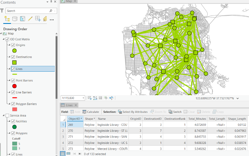
The OD cost matrix displays the libraries serviced by each hospital along with the total drive time for each route. Some libraries are within the 10-minute accessibility zone of more than one hospital and can be served by anyone of them.
Map 3: Create an origin-destination map and accompanying table for the relationship between libraries and hospitals. What is the most accessible hospital? (10 points)
Choosiing optimal store locations using location-allocation
In this part, you will choose the store locations that would generate the most business for a retail chain. The main objective is to locate stores close to population centers, which provide demand for the stores. This objective is based on the premise that people tend to shop more at nearby stores than at those that are farther away. You will perform the location-allocation analysis using three different problem types: maximize attendance, maximize market share, and target market share. The differences among these problem types will become apparent as you work through the exercise.
We will add several new shapefiles to our network map to conduct our analysis. From the data folder, add:
- Existing Store
- Candidate Store: The names of the stores are contained in the layer’s attribute table. These are the potential places where you can open a store
- Competitor store
- Tract Centroids: These are the centroid of the census tract and contain census demographic variables
Creating the location-allocation analysis layer
- On the Analysis tab, in the Workflows group, click
Network Analysis—>Location-Allocation. - The location-allocation analysis layer is added to the Contents pane. The network analysis classes (Facilities, Demand Points, Lines, Point Barriers, Line Barriers, and Polygon Barriers) are empty.
Adding candidate facilities
You will add the candidate stores’ locations to the network analysis class Facilities. The solution from the location-allocation process will include a subset of these stores. You will load the point features from Candidate Stores into the Facilities class of the location-allocation layer.
- On the Location-Allocation tab, in the Input Data group, click Import Facilities.
- Make sure
Input Network Analysis Layeris set toLocation-Allocation andSub Layeris set toFacilities. SelectCandidateStoresfrom theInput Locationsdrop-down list. - In the
Field Mapping, make sure theField Nameis set toNAME. - Leave the default settings for the rest of the parameters and click the OK button.
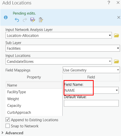
The 16 candidate stores load as facilities. These locations are drawn on the map with the candidate facility symbol.
Add demand points
The stores need to be located to best serve the existing populations. A point layer of census tract centroids is already added to the content pane. Now you will load these centroids into the demand points network analysis class.
- On the
Location-Allocationtab, clickImport Demand Points. - Select
TractCentroidsfrom theInput Locationsdrop-down list. - From
Field Mappings—>Property, chooseWeight. From theField Namedrop-down list, choosePOP2000. - Click the OK button.
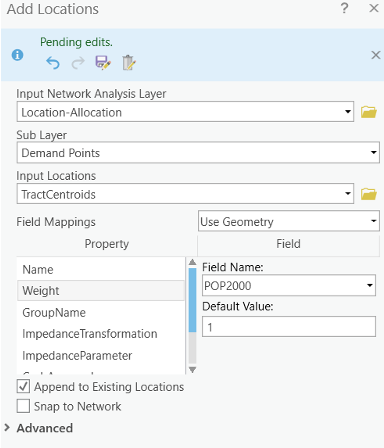
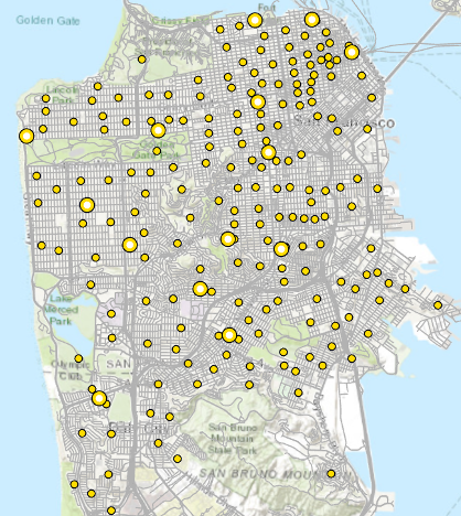
The 208 Tract Centroids load as demand and the population at each location is mapped to the weight property for the demand. These locations are drawn on the map with the demand symbol.
The Location-Allocation tab includes a
Problem Type section, where you can specify properties for
the locations.
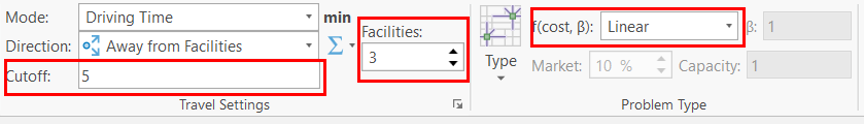
- In the
Problem Typegroup of the Location-Allocation tab, click the arrow under Type
Maximize Attendance. Maximize attendance is a good problem type for choosing retail store locations. It assumes that all stores are equally attractive, and that people are likely to shop at nearby stores. - Increase Facilities to Choose to 3 in the
Travel Settingsgroup. This will choose 3 out of the 16 candidate stores to optimally serve the 208 demand points. - Increase Impedance Cutoff to 5: in the Cutoff text box, type 5. This setting implies that people are not willing to travel more than five minutes to shop at these stores.
- Make sure that Cost Transformation Function is set to Linear. ArcGIS will use a linear decay in calculating people’s propensity to visit a store. That is, with a five-minute impedance cutoff and a linear impedance transformation, the probability of visiting a store decay at 1/5, or 20 percent; therefore, a store one minute away from a demand point has an 80 percent probability of a visit compared to a store four minutes away, which only has a 20 percent probability.
Click the Run button on the Location-Allocation tab. Once the solve process is completed, lines in the map display connect chosen stores to their associated demand points.
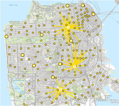
Now you will inspect the results in more detail.
In the Contents pane, right-click the Facilities
sublayer and choose open attribute table. Examine the attributes of the
Facilities table. Three features have their FacilityType field values
set to “Chosen” instead of the default status—“Candidate”.
The DemandCount column lists the number of demand points
assigned to each of the chosen facilities. Note that out of the 208
demand points, only 73 were allocated to the chosen facilities because
some of the points were farther than the five-minute cutoff. The
DemandWeight column lists the demand that is allocated to
each facility. In this case, the value represents the number of people
that are likely to shop at the store. Close the Facilities table.
Open attribute table of the Demand Points sublayer.
Examine the attributes of the Demand Points table. The Facility ID
column has a value of Weight column contains the population count that was loaded
from the census tract feature class. The AllocatedWeight
column contains the amount of demand that was apportioned to the
associated facility. The amount of weight allocated is based on the
linear distance decay and the five-minute cutoff parameters you set.
Open the attribute table of Lines sublayer. This table
contains one record for each demand point allocated to a facility. It
also lists the shortest path impedance between the two locations and the
weight captured by the facility.
Map 4: Create the above Location –Allocation map. Now adjust one of the parameters (eg impedance cutoff, facilities to choose, impedance transformation etc.). Compare and contrast any differences with previous set-up follow the paragraphs above.
Adding competing facilities
Location-allocation can locate new stores to maximize market share in light of competing stores. The market share is computed using a gravity model, which assumes that demand points have a probability of visiting stores based on some properties of the store as well as the distance away from that store.
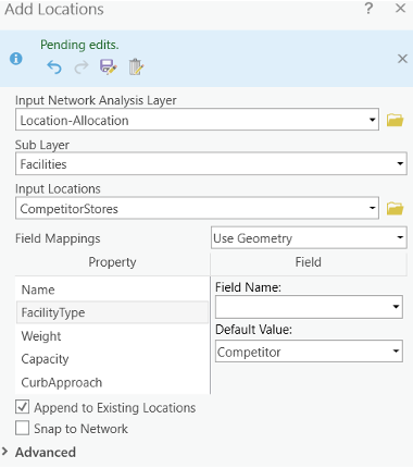
- On the Location-Allocation tab click Import Facilities, and this time choose CompetitorStores as the Input Locations.
- In the Field Mappings section, click FacilityType, and in the Default Value, choose Competitor.
- Click OK.
Setting up the properties of the analysis (maximize market share)
You will change the properties of the location-allocation analysis layer so that it solves using the maximize market share problem type.
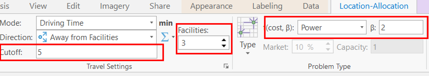
- Open the Location Allocation properties tab and in the Type

- Choose Power for the Cost Transformation Function. ArcGIS will use a power distance decay in determining people’s propensity to visit a store. Notice that Impedance Parameter (β) becomes available for you to edit.
- Change the Impedance Parameter value to 2, which means the probability of visiting a store decay with the square of the distance between a demand point and a facility location.
Run the process to determine the best store locations (maximize market share)
- Click the Run button. To look at the market share attained, click
the “Solve history”
icon

Lines in the map connect demand points to chosen and competitor stores. Notice the chosen stores have changed to maximize the amount of demand given the presence of the three competitors.
The lines overlap more often than in the previous solutions, since each demand point in the maximize market share problem can interact with all the facilities that are within the impedance cutoff.
- In the Contents pane, right click the Facilities sublayer and choose Open Attribute Table. Three facilities have a FacilityType value of Competitor, and three have a value of Chosen, which indicates the solver chose them as the best facilities to open.
- The DemandCount column lists the number of demand points assigned to each of the facilities. Note that some demand points were not assigned, since they were outside the five-minute cutoff.
- The DemandWeight column lists the sum of the demand weight assigned to each of the chosen facilities. The weight assigned to your stores versus that assigned to the competitor stores can be used to figure out the market share that was reported after the solve process finished.
Map 5: Achieving a target market share. In the last section, the three stores chosen accounted for only 28 percent of the market share. Say, however, you want to capture 60 percent of the market share. You need to know the minimum number of stores that would be needed, and where they should be located, to accomplish that goal. How many stores are chosen to achieve target market share? Use the target market share problem type to help you undertake this analysis.
Create a flow map
Open ArcGIS Pro and add tl_2013_us_state.shp and migration.csv (in Part 5 Data).
- tl_2013_us_state is 2013 State shapefile downloaded from TIGER/line
- Open the attribute table for migration.csv. Migration is the state-to-state migration data acquired from county-to-county migration dataset (2009-2013) aggregated at the state level. The data only include state to state migration over 1,000 people to reduce the processing time. Destination_state is the State Code for the destination. Origin_state is the State Code for origin.
State code could be refereed to https://www.census.gov/geo/reference/ansi_statetables.html.
Migrants is the number of migrants from origin state to destination state. y_cor and x_cor show that x- and y- coordination (GCS).
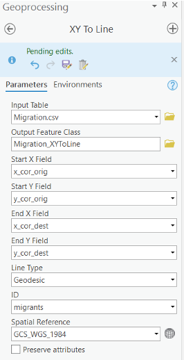
- Go to Geoprocessing toolboxes > Data Management Tools > Features > XY to Line.
- select the start field and end field as shown Above. Note: select migration as the ID, so the number of migrants will be shown in the attribute table of the Migration shapefile.
- click Run. Then, a line shapefile will be created to show the migration from origins to destination. You can turn on the State shapefile to show the state boundaries.
Map 6: Create the map showing migration directions (use arrow). Also, use appropriate classification method to classify the number migrants. You can exclude observations, such as observations with large number of migrants.
Now it’s your turn!!!
Map 1: Create a map layout of your route with stops and barriers (15 points)
Map 2: Service Area map with analysis (15 points)
Map 3: Create an origin-destination map and accompanying table for the relationship between libraries and hospitals. Which one is the most accessible hospital? (15 points)
Map 4: Create the above Location –Allocation map. Now adjust one of the parameters (e.g. impedance cutoff, facilities to choose, impedance transformation etc.). Compare and contrast any differences with previous set-up follow the paragraphs above. (25 points)
Map 5: Create a map layout achieving a target market share. Include discussion (15 points)
Map 6: Create a map layout show the number of migrants from original state to destinations (15 points)
The END